Consistent branding can land you a tasty 23 percent increase in revenue.
And what’s the cornerstone of your brand? You already got the spoiler alert by clicking this article: it’s your logo.
Of course, a killer brand image requires a whole gamut of elements, like your color scheme and graphics, all the way down to your customer service.
But before you get to all that, it’s all about the logo, baby. While the logo is merely an afterthought for so many companies, some of the best logos in the world have quite a bit of thought and purpose behind them.
We’re going to briefly explore what makes a good logo, then take a look at some of the best logos of all time and what makes them so great. From color choice to fonts to symbols, there are so many lessons to glean from the powerhouse companies who did it right.
Let’s do this.
Post Contents

Don’t wait for someone else to do it. Hire yourself and start calling the shots.
Get Started FreeWhat Makes a Good Logo?
Before we get into some of the best logos in the world, it’s important to first understand what makes a logo truly great.
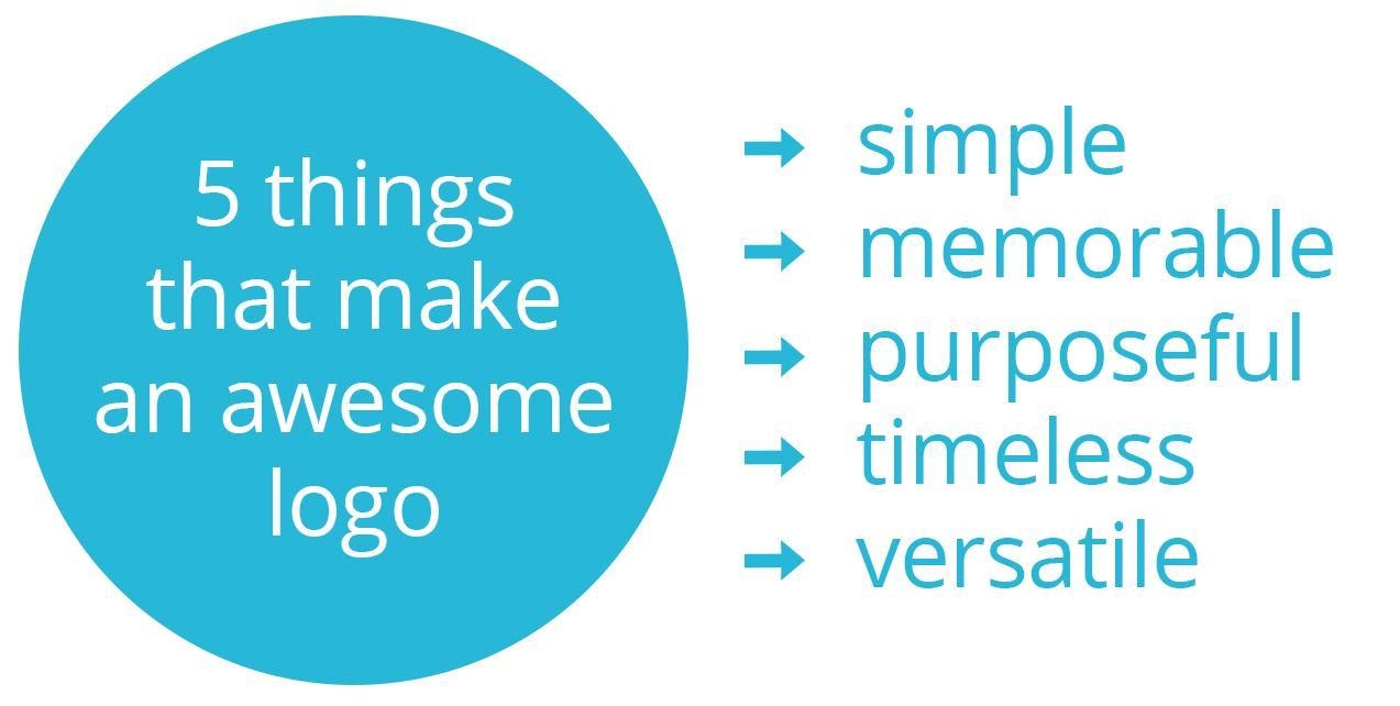
You can break down these criteria into 5 pieces:
- Simple. You know the old K.I.S.S. mantra: keep it simple, stupid. (In hindsight, that saying isn’t very friendly.) The best logos of all time are clean, sharp, and easy to replicate. This in turn boosts some of the other requirements, like how memorable and versatile they are.
- Memorable. Think about the most memorable logos. Isn’t it easy to conjure up their mental image? And isn’t there some element that adds meaning or emotion in a way that boosts how memorable it is?
- Purposeful. You could go willy-nilly with your logo design, but the best logos in the world have purpose with every element. From tapping into color psychology to using symbols that represent certain elements of your brand’s mission and personality, there’s a lot of opportunity.
- Timeless. The best logos withstand the test of time. This should be easy to accomplish, as long as you don’t go out of your way to reference any current events or trends, or include any controversial elements that might get you in trouble later (or now, for that matter).
- Versatile. The best logos ditch the tiny details, fine lines, and nuanced gradients. It needs to be something that looks good everywhere you put it. Think website and social media, but also printed on t-shirts and other fun branding opportunities.
Now that we covered the crash course, let’s dig into the juicy stuff: some of the best logos ever made.
List of 13 Best Logos for Inspiration
1. Apple
Everyone knows it, and that’s why it’s so good. The Apple logo is hands-down one of the best logos in the world because of its simplicity and memorability. There’s also a clever design element that you can take notes on.
The logo’s designer, Rob Janoff, said that when he created the logo in 1977, he included the bite mark “for scale, so people get that it was an apple not a cherry. Also it was kind of iconic about taking a bite out of an apple.” It’s the perfect amount of visual personality to an otherwise normal and non-memorable item.
2. Nike
Yet another example of perfection in simplicity. In addition to its own visual brand, it’s also got its own lingo. Have you ever heard it referred to as “the Nike checkmark?” Of course you haven’t. It’s “the Nike swoosh.”
There’s also powerful symbolism at play with this logo. It’s said to mean many things:
- The swoosh is half of a running track; flip it to create a full track
- The design was purposefully swift and fluid to convey motion and speed
- It symbolizes the wing of Nike, the Greek goddess of victory
- The checkmark goes with their “Just Do It” slogan, showing that you really did it
3. McDonald’s
Similar to Nike, the McDonald’s logo has its own name. It’s not the “yellow M” – it’s the Golden Arches. Anyone who has ever cruised through a town, mall, or airport looking for a snack can tell you exactly what those arches mean. And maybe their tummy growls a bit just thinking about it.
The McDonald’s logo uses bright yellow and red colors to grab your attention fast, which adds to how memorable it is. It also stands out more against the crowd, which is a clever strategy for the fast food world, where there’s always a sea of competitors vying for a hungry person’s attention.
The unique curve of the M is another component that helps it stand out from other logos. You just don’t see that every day.
4. Amazon

As one of the few tech companies worth $1 trillion, Amazon has made its way into hundreds of millions of households across the world. The company’s logo is clean and straight-forward, using a unique-yet-simple font and an arrow icon.
This icon is sometimes called the “smiley arrow.” It’s a clever design that serves two purposes: the first is a subtle smile, the second is an arrow pointing from the A to the Z. This suggests that Amazon can fulfill all of your needs, from A to Z.
It’s also worth noting that branding firm Turner Duckworth made the Amazon arrow and the McDonald’s arches. They’re nailing it.
5. I ❤ NY
Many cities have their own logo, but few are as iconic, memorable, and nostalgic as this one. As a bonus, “I love New York” also doubles as the state’s slogan (with its own song too). This logo is the brainchild of a 1977 advertising campaign gone so, so right.
The serif font gives the logo an extra shot of personality, balancing well against the smooth, rounded heart. The pop of red is the classic heart color, playing on our brain’s natural tendency to associate the shape and color while helping it stand out next to the black font.
6. Lego
I don’t know about you, but when I see the Lego logo, I see adventure and excitement. It just pops right out at you, with bright, engaging, and inviting colors and lettering.
One of the main reasons this logo is so attention-grabbing is the red square around the wordmark logo. It conjures up the actual image of a Lego – a single building block that separates a tiny builder from the wide and limitless world of their own imagination.
The font is bold, captivating, and leaves a lasting impression. Bubble letters have a very specific personality to them, so they should be used wisely. And a couple of those use cases is for an imaginative or kid-focused brand, which is just what Lego is.
7. Chanel

This is another one of the most recognized logos. It’s been going strong since 1920, after all. Here’s another cool tidbit: the company’s creator Coco Chanel was the only fashion designer who landed a spot on Time magazine’s 1999 list “The Most Important People of the Century.”
The interlocked C’s represent Coco’s initials. The clean lines and symmetry naturally lend themselves to the minimalist visuals of high-fashion branding. This is an important lesson to glean for anyone researching elements of a good logo: fitting in with the branding themes and concepts of your industry.
8. Target
When it comes to power and purpose, Target is… well, right on target. Maybe it’s luck that a bullseye is naturally round in shape, but you can’t get any more simplistic than a few stacked circles – all while perfectly representing the company. Plus, circles represent connectedness and community, which is something the Target brand conveys as a whole.
This retail giant is all over the US, but it’s also been able to gain a strong international presence, with more than 11,000 stores in 27 countries. While there’s no way to prove that their awesome logo is a contributor to their success, I think it’s safe to say that it’s helped.
9. Microsoft

After 25 years without a redesign, Microsoft unveiled a 2012 update to what was already one of the most recognized logos in the world. In a blog post announcing the redesign, General Manager of Brand Strategy Jeff Hansen explained that the redesign came with several new changed to the company itself.
He said: “This wave of new releases is not only a reimagining of our most popular products, but also represents a new era for Microsoft, so our logo should evolve to visually accentuate this new beginning.”
The multi-colored squares each represent different Microsoft offerings, like Windows, Office, and Xbox. Staying true to the brand image, the logo uses Segoe font, which is the font used across Microsoft software.
10. Pepsi
Another international icon with its own name, the “Pepsi Globe” has had many iterations since the birth of the company in 1903 (though the Globe itself didn’t come around until the 1940s).
This is hands-down one of the world’s most recognized logos. This Globe truly has a place around the globe.
In the most recent iteration, the white area of the Globe became non-symmetrical. Because of the shape, it’s also referred to as a smile… because so many of us feel a little extra joy when we crack open a can of sweet, fizzy goodness. The lowercase font accompanies that smile by reinforcing the logo’s laid-back vibe.
11. Audi
Like we discussed earlier, circles represent unity and togetherness. By interlocking several of them, Audi does a great job showing off these virtues and landing itself a spot as one of the best minimalist logos.
Even better: each of those four rings has a specific purpose. They stand for the four vehicle manufacturers that merged in 1932 to become the company we know today as Audi. Those companies were DKW, Horch, Wanderer, and… you guessed it, Audi.
The black color and 2D rings are a recent take on what used to be silver 3D rings that were meant to look like chained links. This new aesthetic brings the company up to speed with more modern and sleek design practices.
12. Google

At first glance, the Google logo just looks like a colorful spectacle. But when you look a bit closer, you can see that the creators chose the colors carefully.
It mostly uses the three primary colors: red, blue, and yellow. Red and blue each have two letters, but yellow only has one. And so does green. This is almost an act of rebellion: just the right amount of boldness to defy expectations.
It’s fun to think about how the designers probably looked at and evaluated hundreds or even thousands of color combinations before settling on this one!
13. Twitter
There’s so much thought that went into this cute little bird. There were many iterations, but Twitter’s founder Jack Dorsey immediately knew that this would be the one, even when it was presented with 25 other variations.
The Twitter bird has a surface level meaning: Twitter is a platform of several, short communications, similar to how a bird tweets. But this is one of the best creative logos because of the subtle visual elements they worked in. The smooth, clean lines represent speed and clarity.
My favorite fun fact: Those lines are all so smooth and clean because the Twitter bird is made up of 15 intersecting circles. How cool is that?
Don’t Overlook the Importance of a Good Logo
If you’re looking for tips and insights into your own logo, take this as a word of advice: instead of slapping something together, put some real through and purpose into your logo.
Use symbolism. Keep it simple and powerful. Do your research so that your logo stays in line with the general vibe of your industry and your audience.
While a logo won’t exactly make or break your ability to succeed as a company, it can be an incredible boost to help you win over the hearts and minds of your potential customer.
The best brand logos have the ability to create faster, deeper connections with the people they serve – don’t miss that opportunity for your own brand.
