So, you’re all set to launch your new dropshipping business:
- You know who your target audience is
- You have a product ready to sell
- You know the answers to popular Facebook ads questions
- And you’ve got the Facebook marketing basics under your belt
There’s just one critical problem holding you back…
You ain’t exactly Picasso.
I feel you.
But if your Facebook ads are going to succeed, it’s absolutely vital that you create a killer Facebook ad design.
Why?
Because images account for 75-90% of Facebook advertising effectivity/performance.
*Gulp*
It gets worse…
Competition is fierce.
Facebook is by far the most popular social advertising channel.
According to Social Media Examiner’s 2017 Industry Report, a massive 93% of social media advertisers use Facebook Ads.
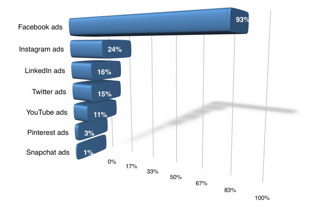
(Source)
But don’t run for the hills just yet.
There’s a reason Facebook ads are so popular: They can work like crazy.
Take The Swamp Company.
This women’s outdoor apparel company used Facebook ads to generate a huge 276-times return on advertising spend.
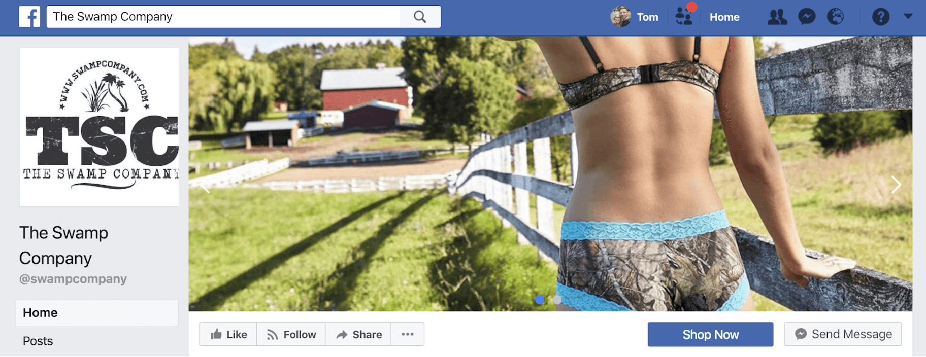
In other words, for every $1 they put in, they got $276 back.
So, let’s get you one step closer to success with a killer Facebook ad design.
Sound good?
Post Contents

Don’t wait for someone else to do it. Hire yourself and start calling the shots.
Get Started FreeDouble-Check Your Foundation
First things first.
Your Facebook ad needs to…
- Be relevant to your target market
- Have a clear value proposition
- Include a single call-to-action
So, before you start designing, make sure you know:
- Who your target market is: what they like, what kind of language they use, what colors appeal to them, etc.
- What your value proposition is: Simply put, what’s in it for them? Why should they buy from you instead of other businesses?
- What you want them to do next: sign up to your mailing list? Learn more about your product? Click through to the product page to buy now?
If you don’t nail these things, no amount of fancy graphics will save you.
So, don’t skip this.
Take a few minutes now to be absolutely clear on each of these before you continue.
Choose Your Facebook Ad Format
Okay, it’s time to start the process of designing your Facebook ad!
Let’s jump straight in.
There are 5 different types of Facebook ads to choose from.
- Carousel
- Single image
- Single video
- Slideshow
- Canvas

(Source)
Today, we’re going to focus on the two image-based options:
- Single Image
- Carousel (2 or more scrollable images)
1. The Single Image Facebook Ad
Yep, you guessed it…
With this ad format, you get just one single image.
Here’s an example from Wool & Prince:
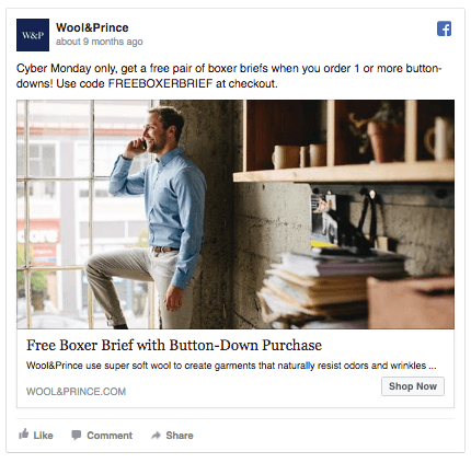
(Source)
But, it doesn’t mean you can’t show multiple images of your products in a Single Image ad.
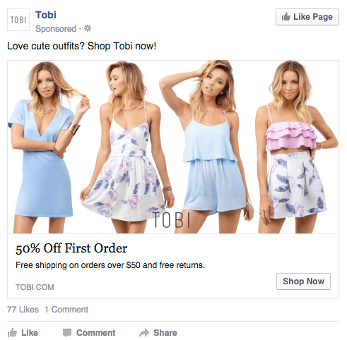
Take this ad from online fashion retailer Tobi. They showcased multiple products in a single image.
(Source)
And it’s a tactic that’s working well for them.
Tobi achieved a 2x increase in daily revenue with ads that displayed a range of outfits.
Why does it work?
With multiple products showcased, there’s a higher chance that the viewer will like a product.
Next up:
2. The Carousel Facebook Ad
This ad format is a little more adventurous.
Carousel ads allow you to use 2-10 scrollable images. Meaning you can showcase multiple products or offers within one ad.
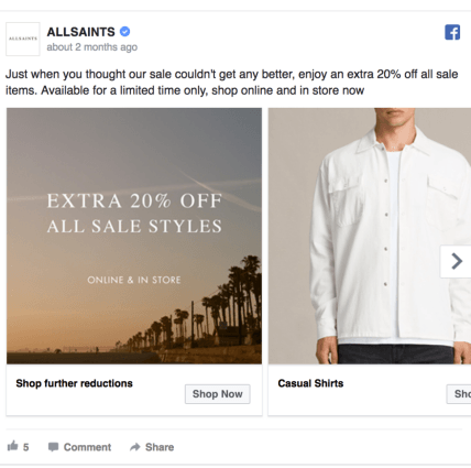
Here’s an example from ALLSAINTS.
(Source)
Viewers can scroll through the images and click on individual links for different products.
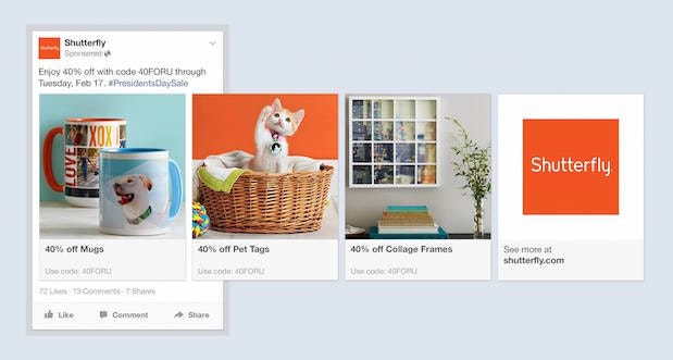
This example from Shutterfly shows all of the images that are used in their ad.
(Source)
Notice how each image highlights a different set of products, allowing this one ad to appeal to many different viewers.
You can also use Carousel ads to tell a story, like a short comic strip.
Derin Oyekan, co-founder, and CMO of JewelScent, said:
“We used carousel link ads to tell a story about our product. The results were a three-fold decrease in cost per click, driving more volume of potential customers for less money to our website.”
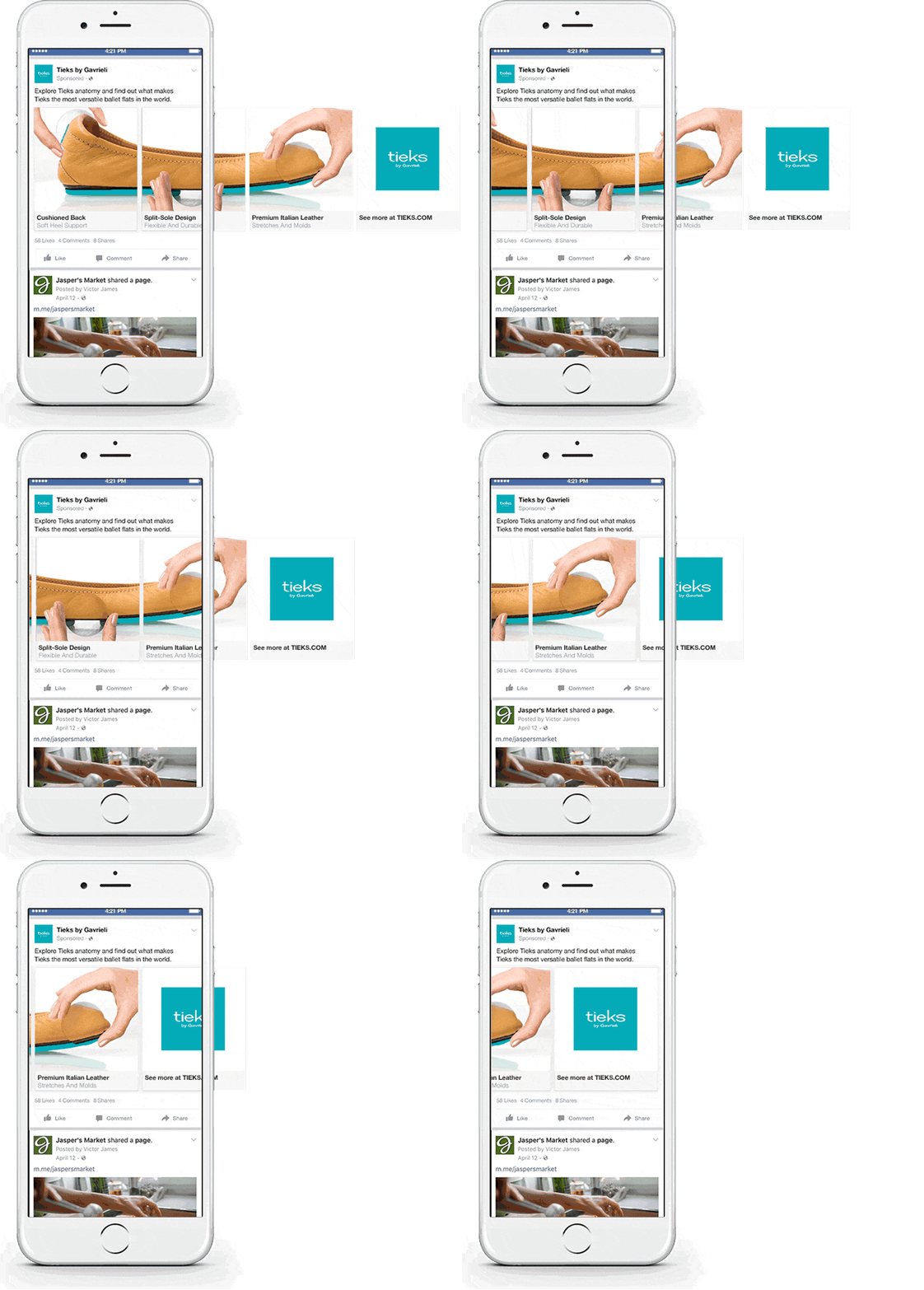
Here, Tieks by Gavrieli creatively uses a Carousel ad to highlight the different features of their ballet flats.
(Source)
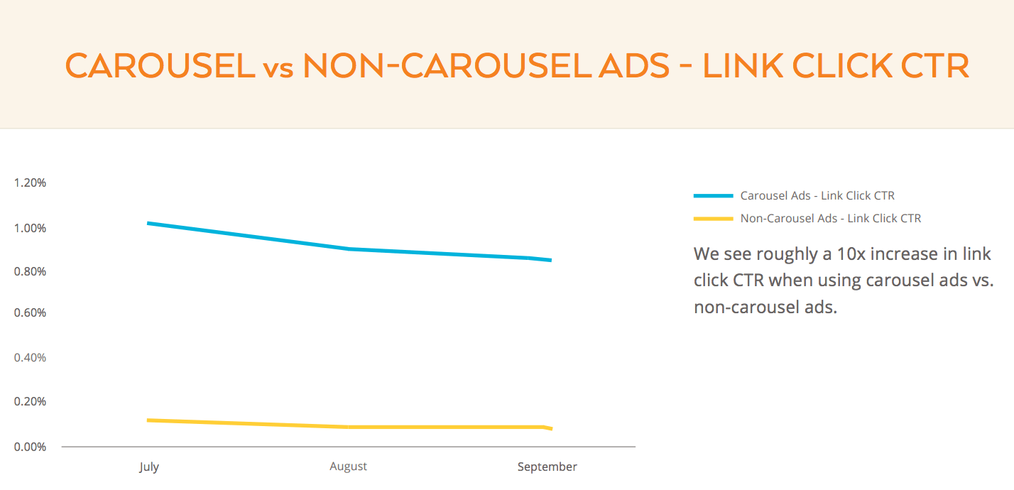
Although they’re more difficult to produce, carousel ads perform better than single image ads.
Kinetic Social found that they get up to 10 times higher click-through rates compared to static sponsored posts.
(Source)
So, Single Image or Carousel?
If your design skills are limited, or if you’re creating your first Facebook ad, I’d recommend using a Single Image to start.
But if you have plenty of great images you can use, and a little more time on your hands, opt for a Carousel ad.
Now, let’s get into the fun stuff.
Choose Your Image/s
Two quick things for best results:
- Use high definition images
- Use professional photographs
Okay, here are six things to consider when choosing an image for your Facebook ad design.
1. Showcase Your Product
Images are powerful.
According to a study by the University of Iowa, we remember things we see much longer than things we hear.
So, place your product front and center.
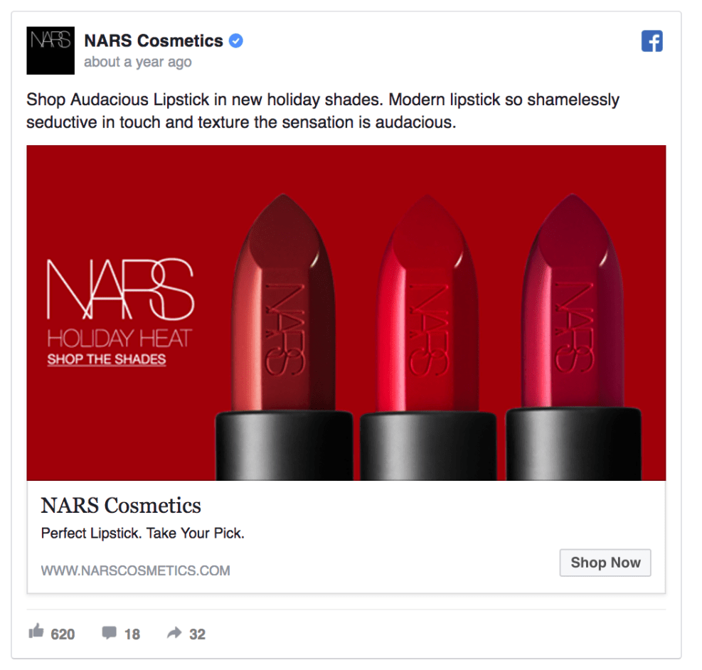
In this ad, NARS Cosmetics boldly showcase their lipsticks.
(Source)
You might be able to use the product images from AliExpress, but there’s a good chance that you’ll need to doll them up in a program like Photoshop.
It’s always best to order a product and take your own photos.
That way, you can stand out from the competition with unique, professional-looking photos.
Up next:
2. Include Real People in Your Facebook Ad Design
Why?
Because Marketing Experiments found that using a real person associated with your product, instead of a stock photo, can increase conversions by a massive 35%.
And, according to research by Psychological Science, seeing a smiling person makes us feel happy, comfortable and safe.
Sold?
Just make sure that the people look like those in your target market. You want viewers to find your ad relatable.
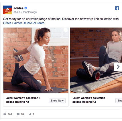
Here’s a good example from Adidas.
(Source)
While trying to sell their new women’s sportswear range, Adidas include pictures of a young, fit and sporty woman.
Simple, but powerful.
Including people from your target market prompts people to feel like the product is for them in particular.
It also encourages them to imagine themselves using your product…
Making them more likely to purchase.
#ChaChing
3. Use the Power of Emotion
Don’t get me wrong, dropshipping is an incredible opportunity.
But, the nature of the business means you’ll be selling generic products.
One way is to sell the ‘lifestyle’ and the feelings that your products can create.
How?
Hit them right in the feels.
Does this work?
You bet.
One study found that campaigns with purely emotional content perform almost twice as well (31% vs. 16%) as those with only rational content.
So, think about your target audience.
Next, list three words that describe the emotions you would associate with them.
Use words like:
- Elegant
- Vibrant
- Serious
- Relaxed
- Edgy
- Active etc.,
Then go deeper.
What are their hopes, dreams, fears, and worries? What kind of life appeals to them?
Grab a pen and paper and write down everything you can think of.
Then choose an image that represents those things.
Coca-Cola might use words like excitement, friendship, youthfulness, and happiness.
Which is why they would use an image like this:

(Source)
But, make sure that the emotion conveyed in your image matches your ad’s offer.
Take Eventbrite.
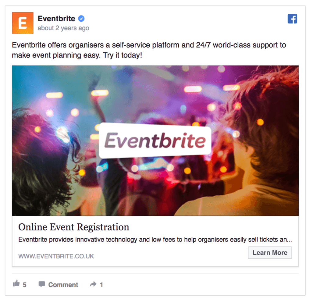
They sell event tickets. And, in this ad, they’ve used a colorful image of people at a concert that looks fun and exciting.
(Source)
This image doesn’t focus on selling event tickets. Instead, it sells the feeling you get when you go to an event.
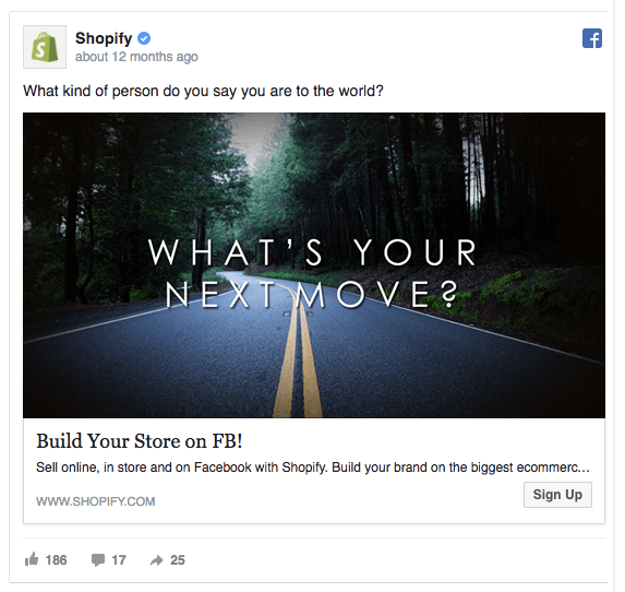
This next example from Shopify inspires and motivates.
How?
By using an image of a road stretching into the distance which represents future possibilities and adventure.
(Source)
It also couples the image with the provocative question, “What kind of person do you say you are to the world?”
This ad isn’t selling ecommerce software.
It’s selling the opportunity to change your life and become the person you’ve always wanted to be.
4. Consider Color Psychology
Color is important.
People make up their minds about people or products within 90 seconds. And, 62‐90% of their assessment is based on colors alone.
Which is kinda weird when you stop to think about it.
Anyway, when choosing an image, be sure to consider colors carefully.
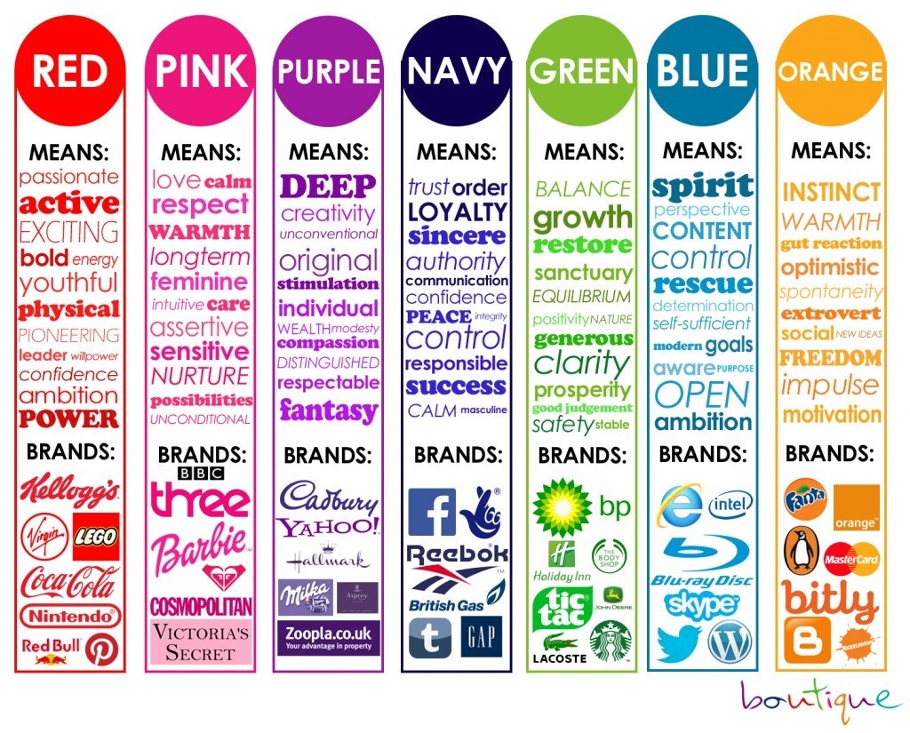
This graphic from Boutique shows a broad overview of emotions associated with colors and gives examples of companies who use them.
(Source)
Think back to the emotions you would associate with your target market.
Which colors best represent them?
5. Match Your Facebook Ad Design with Your Web Page
AdEspresso discovered that 69% of all Facebook ads link to a landing page.
In this case, you should match your Facebook ad design with your landing page.
Why?
Because a study by McKinsey & Company found that a consistent customer experience across the entire customer journey will increase customer satisfaction, build trust and boost loyalty.
So, match your Facebook ad design to your site to boost sales and create a consistent customer experience.
6. How to Find Free Stock Images
Tread carefully.
Using an image that you don’t have the rights to, for commercial purposes, can end badly.
No one likes to be sued.
Thankfully, there’s an easy way to avoid such a nightmare.
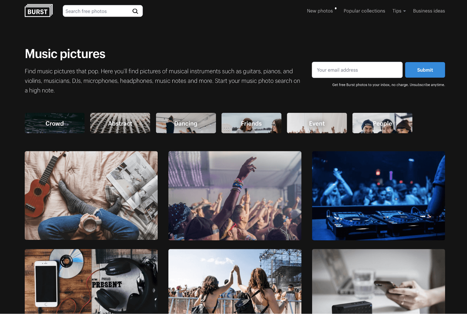
First stop? Burst by Shopify.
Second stop? Unsplash.
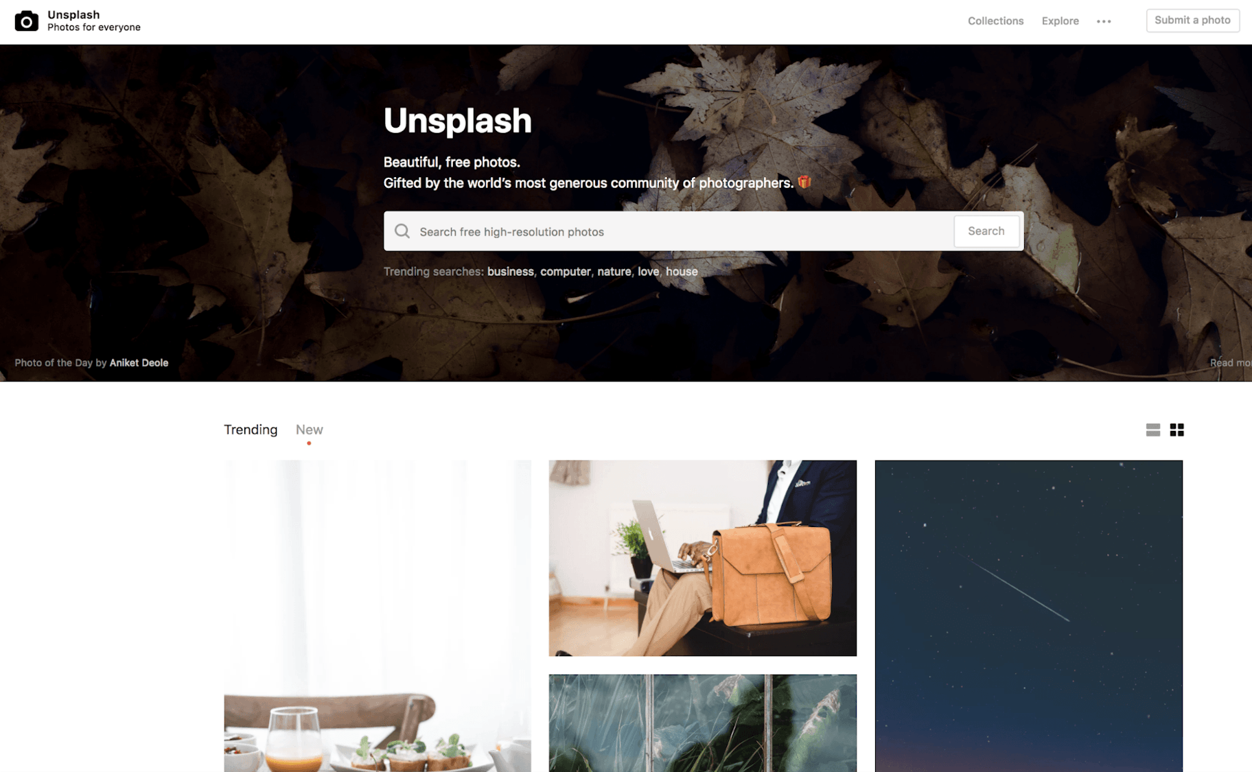
Both of these sites have tons of free images you can use for commercial purposes.
The photos are licensed under the ‘Creative Commons License’.
This means you can download, copy, modify, distribute, display and use them until your heart’s content… for free.
We live in a wonderful world, don’t we?
You don’t even need to credit the photographer, Shopify, Burst or Unsplash either.
Although both sites encourage you to do so whenever possible.
They’re nice like that.
Pause and Recap
Okay, that was a lot in one go.
But hopefully by now, you’ve:
- Chosen your ad format (Single Image or Carousel?)
- Got a few decent potential images picked out
Now, it’s time to get designing!
Create Your Facebook Ad Design
The next three sentences will be boring.
Facebook allows advertisers to upload images in different sizes. But, following the guidelines is the best way to make sure your ad looks great on every screen.
So, your design should be at least 1200 x 628 pixels wide (the standard size).
Did your eyes glaze over?
Yeah, me too.
Thankfully, you don’t have to worry about this if you use the free graphic design tool Canva!
So, let’s do that.
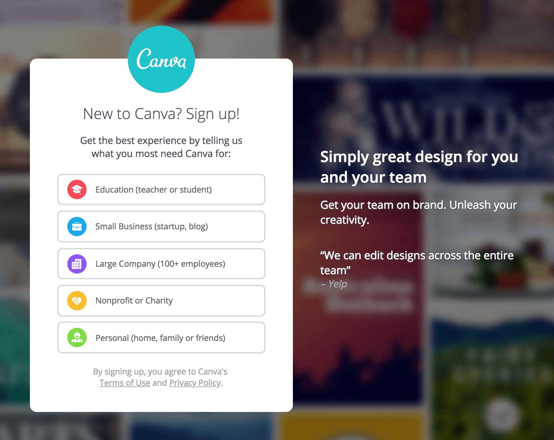
1. Sign up to Canva
Simply go to the Canva website and create a free account.
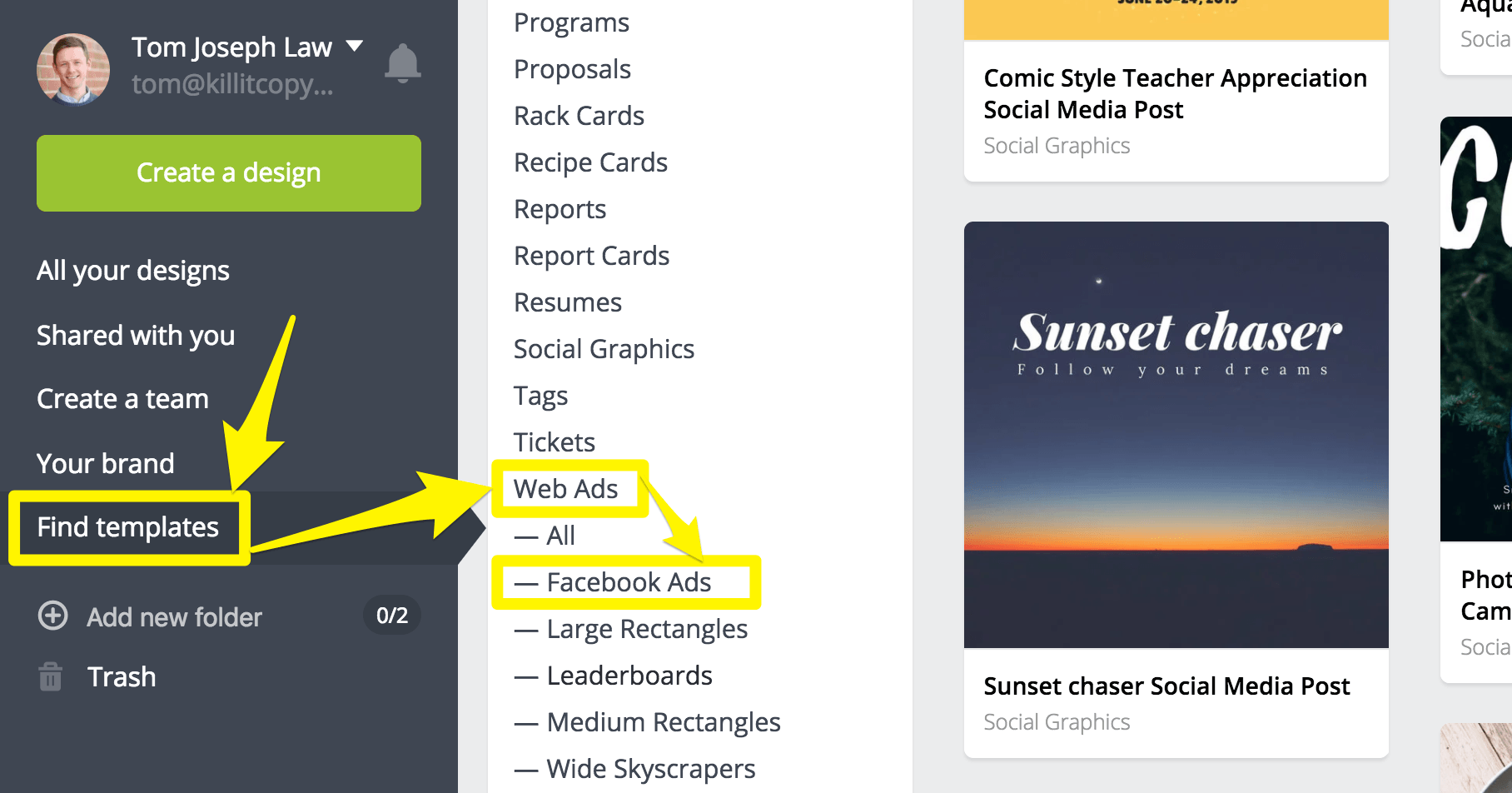
Then, once you’re logged in, click, ‘Find Templates’ in the left sidebar.
Then click, ‘Web Ads,’ and lastly, ‘Facebook Ads.’
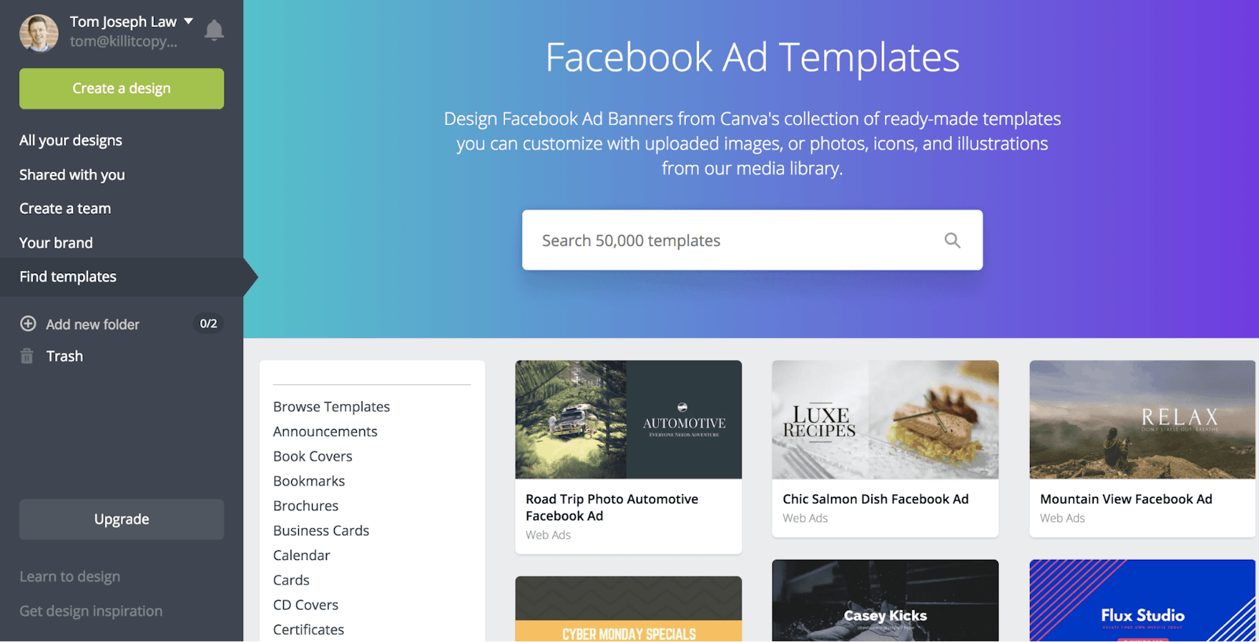
Ta-da!
This will bring up a whole bunch of pre-made Facebook ad design templates for you to choose from.
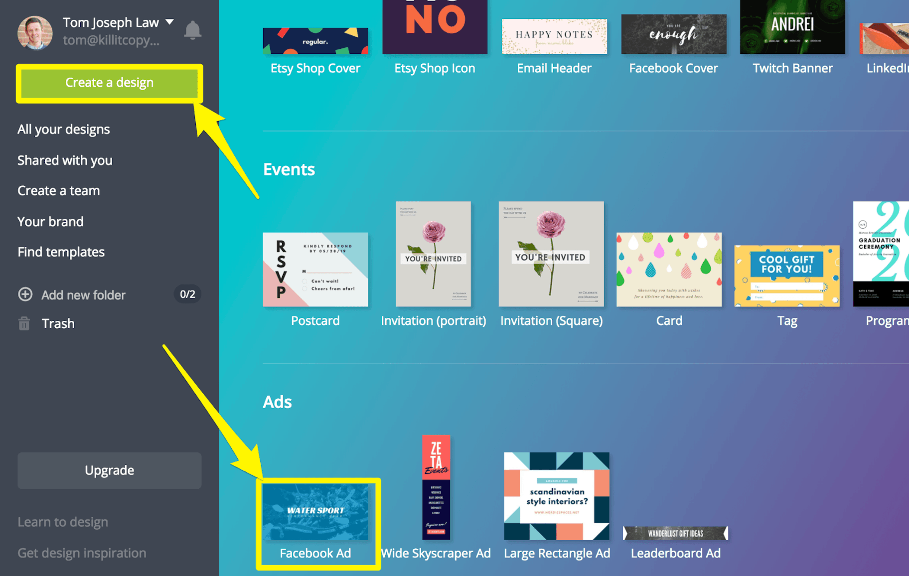
If you’d prefer to start from a blank template, simply click ‘Create a design.’
Then scroll to the very bottom and click ‘Facebook Ad.’
2. Choose a Layout
If you opted for a blank template and want to check out the templates after all, it’s no biggie.
Just click the ‘Layouts’ link in the left sidebar.
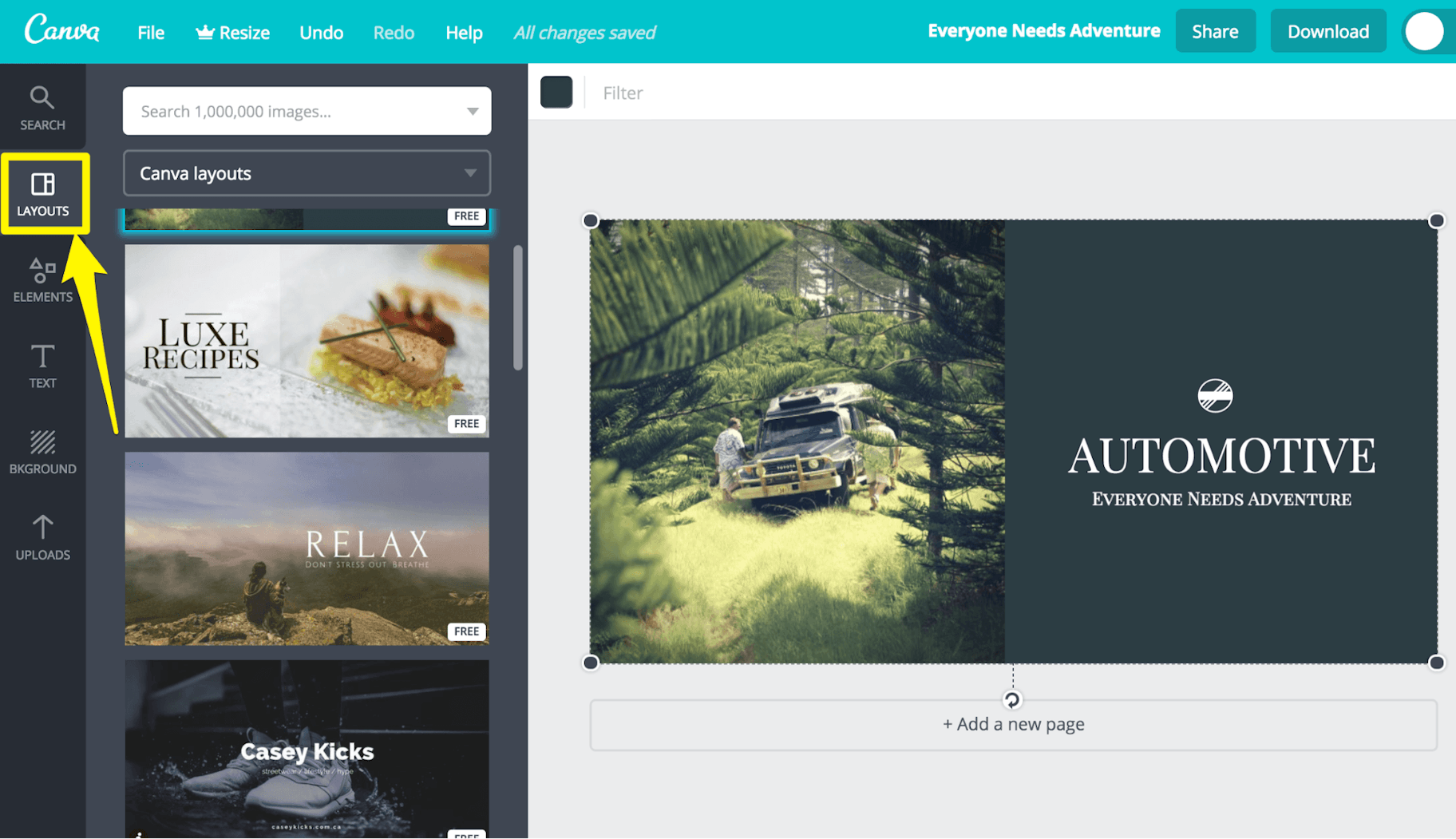
Find a template that catches your eye.
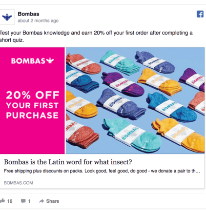
If your graphic design skills aren’t great, consider splitting the image into two main parts.
Check out this example from Bombas.
(Source)
This ecommerce sock company created a striking design with a colorful photo of their socks, and an eye-catching pink section highlighting their promoted offer.
Simple and strong.
Plus, this can look great even if you only have a few simple product images to work with.
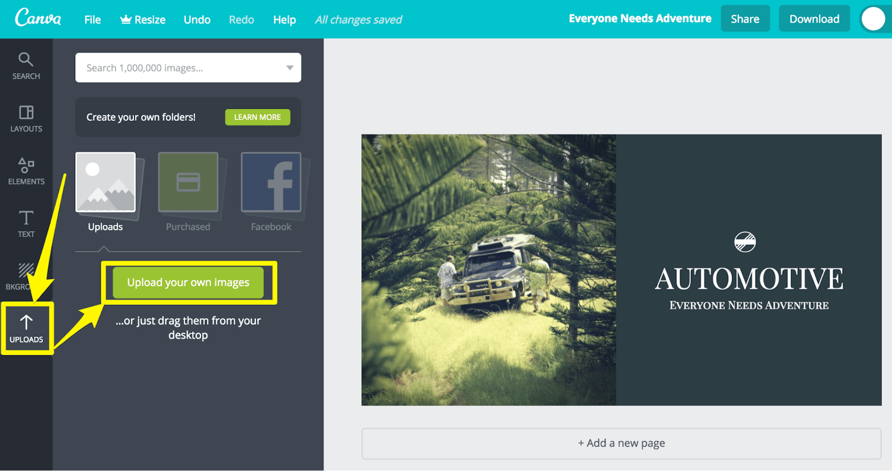
3. Upload Your Image
Next, you need to upload your image.
Simply click the ‘Upload’ link in the left sidebar.
Then click ‘Upload your own images’ and select the images you want to use in your ad.
4. Use Contrasting Colors
Contrasting colors can be very effective.
Research by Usability Tools showed that using highly contrasting landing page call-to-actions resulted in a 75% higher click-through rate, compared to a low-contrast CTA.
Contrasting colors help draw attention to the ad.
And there’s more.
ScienceDirect discovered that, while a large majority of consumers prefer color patterns with similar hues, they favor palettes with a highly contrasting accent color.
Having fun yet?
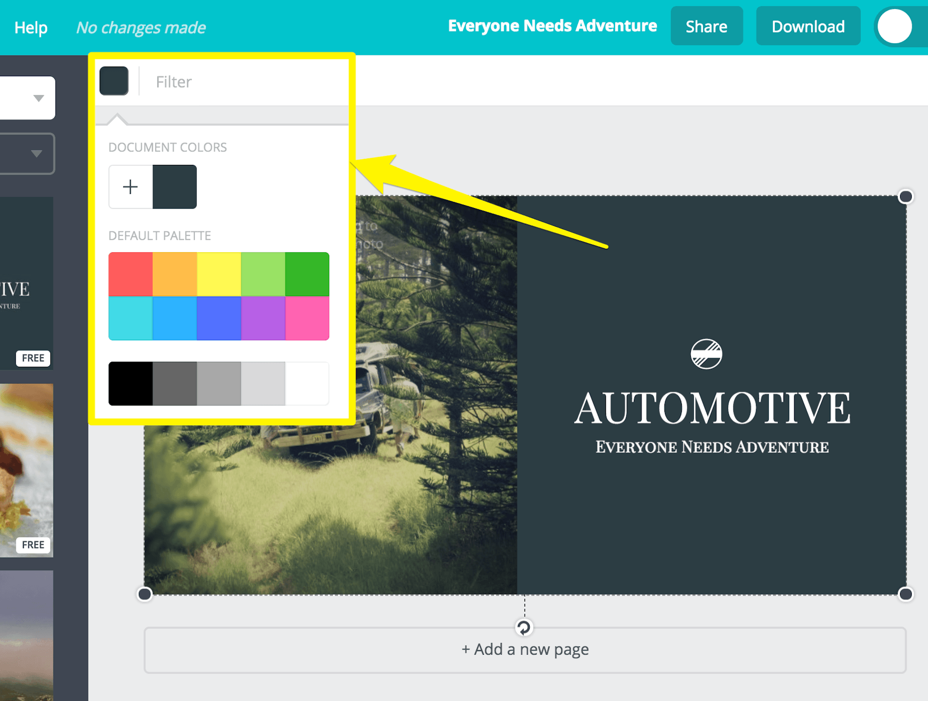
5. Edit Your Colors in Canva
You can click any element in Canva to bring up editing options.
Once you’ve clicked an element, click the small colored square to show the color options.
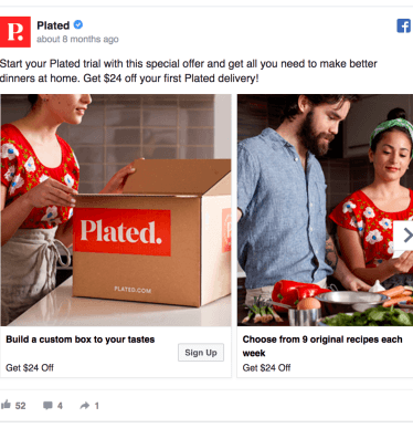
6. Include Your Logo
Adding your logo to your design can help to reassure the viewer.
Even if you’re a new business, small touches like this can help give the impression that you’re an established company.
Here’s an example from Plated, who manage to include their company logo in the first image naturally.
(Source)
Pause and Recap
Okay, now you’re kicking ass!
Hopefully, by now you’ve:
- Chosen your ad format
- Found some good images
- Picked a design template
- Started playing around with your design
Now, it’s time to talk text!
Add Text to Your Facebook Ad Design
Adding text to your design can help your offer stand out.
But there’s a catch…
1. Keep Text to a Minimum
Why?
Because Facebook doesn’t like ads with too much text on them. And, if you include too much text, Facebook will start to limit your ad’s reach.
Your Facebook ad design will fall into one of four classifications:
- OK
- Low
- Medium
- High
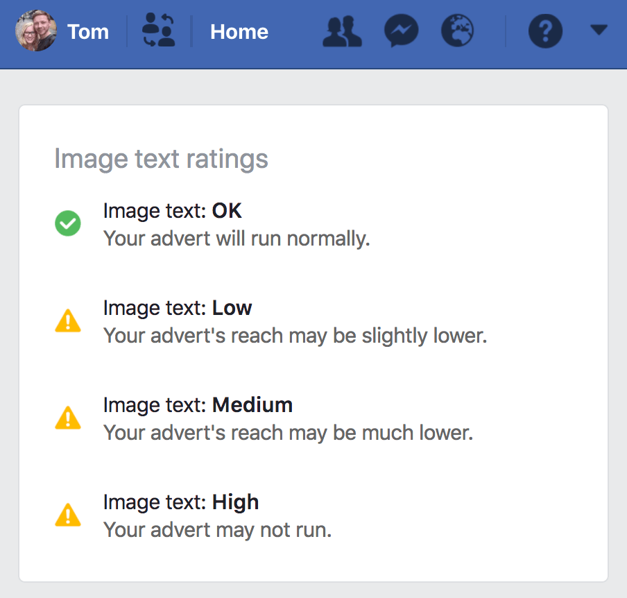
Simply, the more text you use, the more likely your ad’s reach will be restricted.
Thankfully, there’s a simple way to check your design.
Head over to Facebook’s Text Overlay Tool and upload your design to test your ad’s text classification.
Here, I uploaded an absolutely gorgeous photo (of myself) without any text:
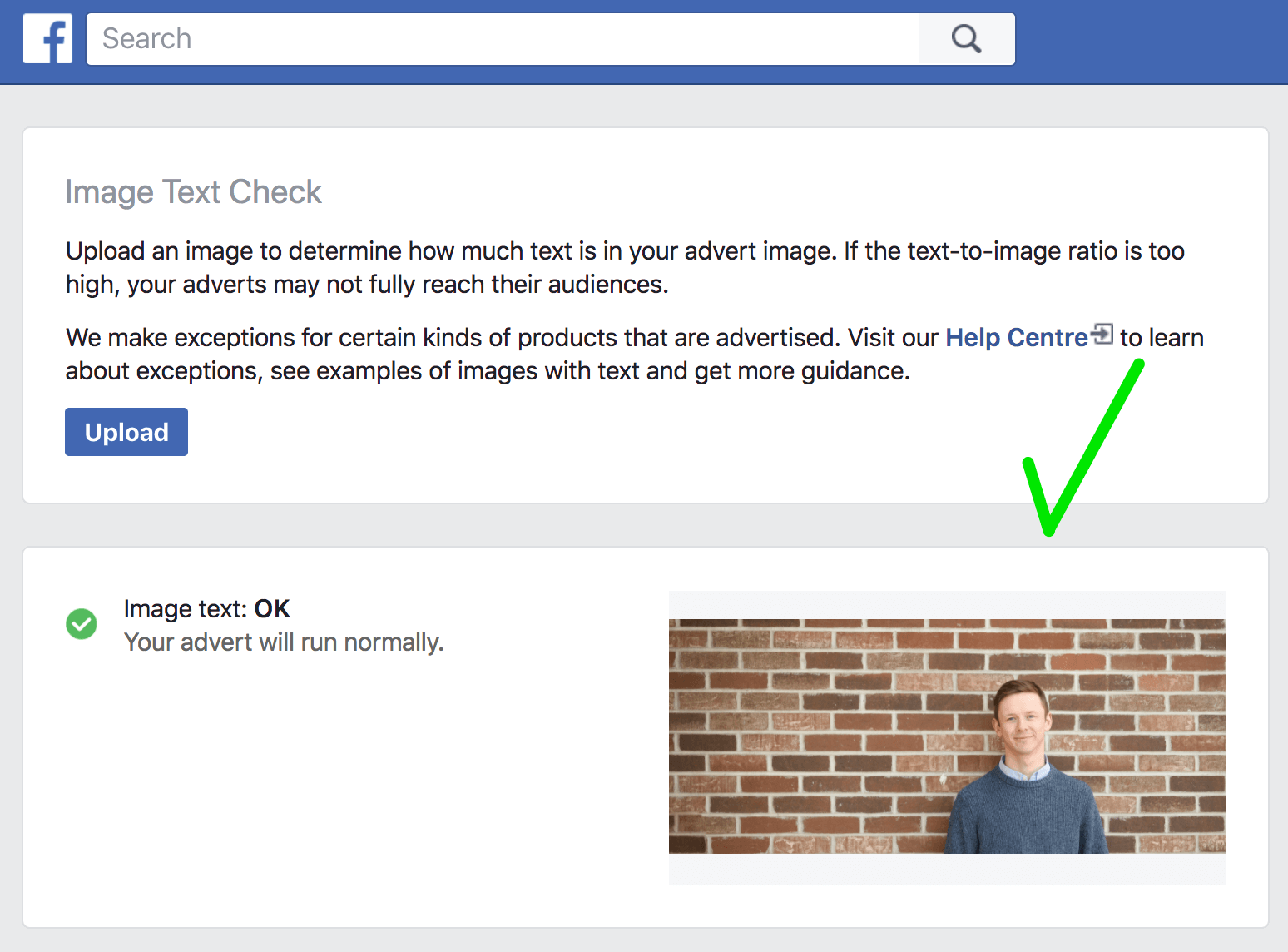
And you can see that Facebook deems it ‘OK’.
Then I uploaded the same image with text on it.
This time, the image was labeled ‘Medium’, with Facebook warning me that my “advert’s reach may be much lower.”
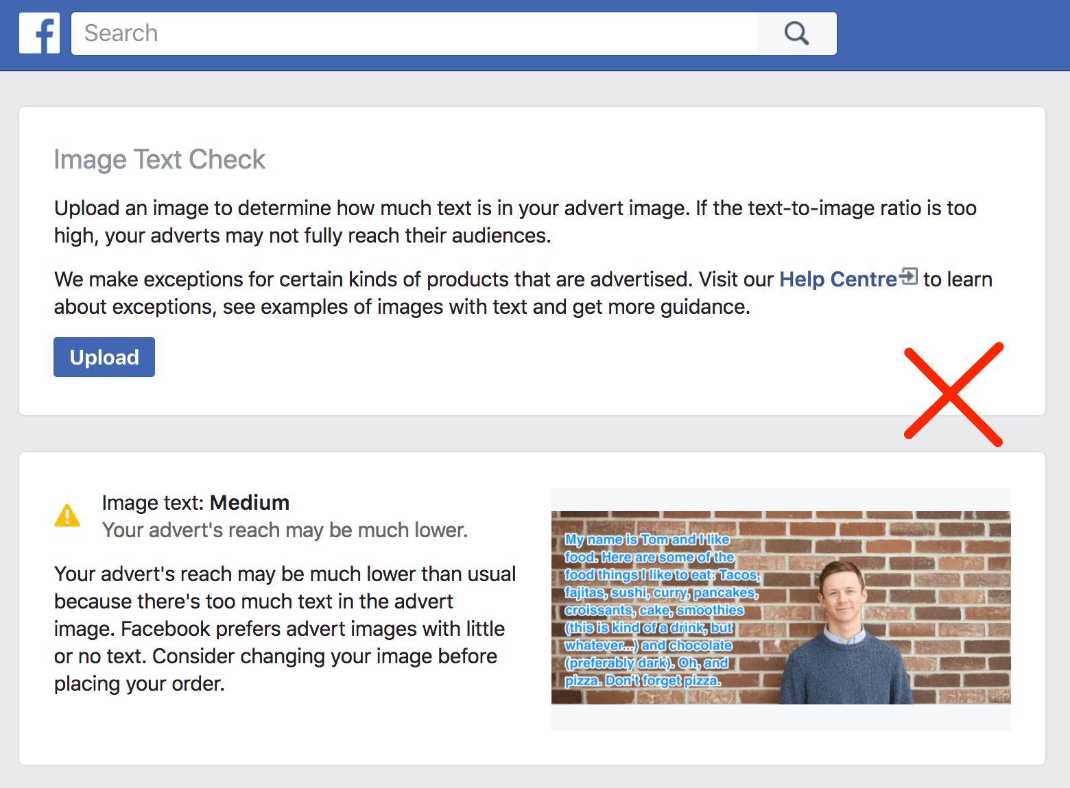
When it comes to overlaying text onto your design, less is more.
So, cut your message down to a few carefully chosen words.
Okay, but what should you write?
Let’s run through the options.
2. Include Your Value Proposition
Many advertisers include their value proposition in their Facebook ad design.
Your value proposition is the statement you use to summarize why a consumer should buy your product.
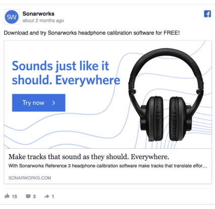
Take this example from Sonarworks.
They sell software and headphones to improve sound for music producers.
Their value proposition? “Sounds just like it should. Everywhere.”
(Source)
What problem are you solving for your target market?
3. Include an Offer
Coupons are very, very effective.
Coupons.com discovered that shoppers who received a $10 voucher, experienced a 38% rise in their levels of oxytocin, which is a positive-feedback hormone.
The shoppers also experienced decreased heart rates and respiration rates, indicating lower stress levels.
Cool, huh?
And, research by VoucherCloud found that 57% of shoppers are motivated to complete a first-time purchase when they are able to redeem a coupon.
Discount codes add a sense of exclusivity to your promotion, in a way that site-wide discounts don’t.
Everyone likes to feel they’ve got a bargain and are one of the special few.
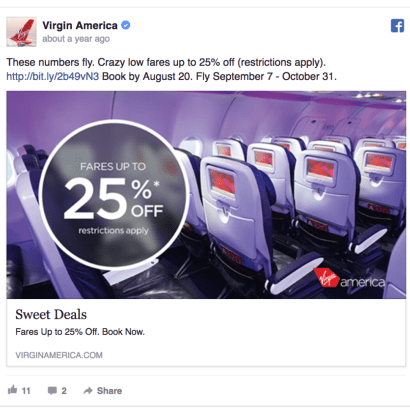
So, consider overlaying text highlighting a discount in your Facebook ad design, like in this example from Virgin America:
(Source)
Finally, kick it up a gear by creating urgency with a flash sale.
Why?
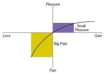
Because when people lose something, it’s twice as painful as the amount of pleasure they would get from gaining something.
Just let that sink in for a moment.
Crazy, isn’t it? And when it comes to selling, it’s powerful stuff.
This comes from psychologist Daniel Kahneman’s Loss Aversion Theory.
(Source)
When you create a time-sensitive offer, just be sure that you clearly communicate exactly when the deal will end.
If your Facebook ad says, “24 Hour Sale,” people will think they have 24 hours to get the discount.
Instead say, “This sale ends at 10 pm PST tonight!”
This way, the viewer knows exactly when the deal will expire and feel even more compelled to act quickly and impulse buy.
Here’s a good one:
4. Add a CTA to the Image
A compelling call-to-action makes people more likely to act.
Conversion expert Jeremy Smith says:
“Your CTA buttons are the most valuable feature of your entire website. The CTA is where it all happens — all the conversions, all the revenue, all the action.”
What is it you want viewers to do?
Consider telling them in your Facebook ad design.
5. Use Social Proof
What is social proof?
It’s the name given to people’s reliance on the feedback and actions of others to determine what is right and what is wrong in a given situation.
Basically, social proof leads the viewer to think, “If they like it, I will too.”
And it’s a very, very powerful tactic in selling.
One study found that 79% of consumers trust online reviews as much as personal recommendations before making a buying decision.
What’s more, Kissmetrics tested Facebook ads with customer content against ads with only brand content. And they found that Facebook ads with user-generated content had:
- 300% higher click-through rate (CTR)
- 50% lower cost per click (CPC)
- 50% lower cost per acquisition (CPA)
So, how can you leverage social proof in your Facebook ad design?
There are many different ways, from testimonials and product endorsements to showcasing the large number of sales you’ve had.
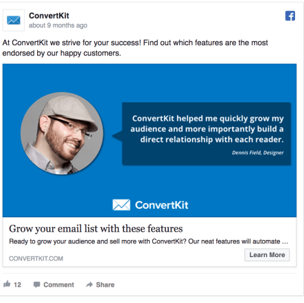
Here’s an ad from Convert Kit featuring a customer testimonial:
(Source)
Here’s another example from custom shirt maker Proper Cloth:
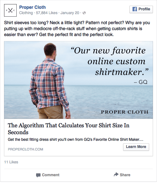
Social proof score? Off-the-chart.
Not only have Proper Cloth used a testimonial on the graphic itself, it’s from GQ — a large, reputable brand.
6. Edit Your Design’s Text
To add text to your Facebook ad design, just click the ‘Text’ link in the left sidebar.
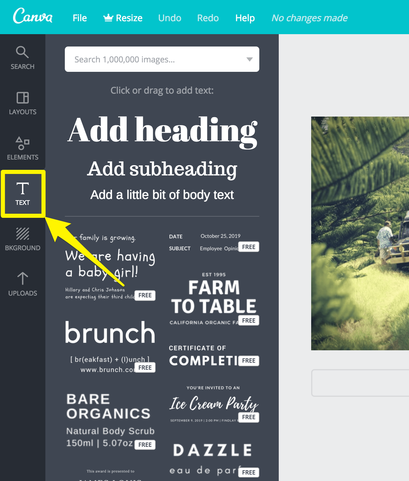
Or, if you chose to work from a template, simply click on the text you’d like to edit.
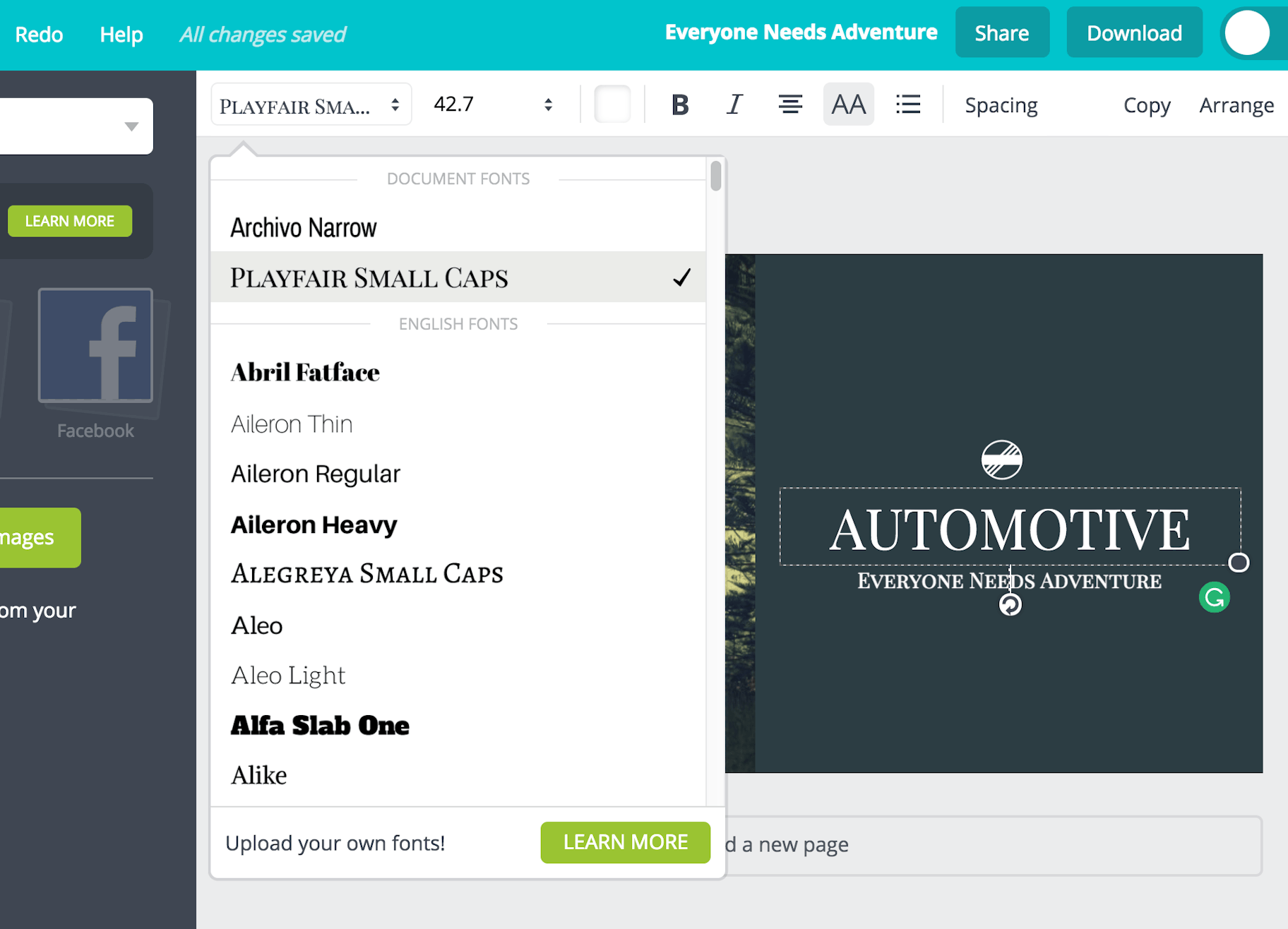
7. Choose a Font
Thankfully, Canva has tons of free fonts to choose from.
Now, think back to the emotions you associated with your target market.
Are they fun or serious? Classy or funky?
By picking a font that resonates with your target market, you’ll stand a better chance of grabbing their attention.
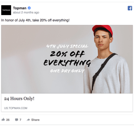
For example, Topman targets young, fashion-conscious guys.
So in this ad, they chose an edgy, marker font.
(Source)
If your target audience was a font, what would they look like?
8. Download Your Finished Facebook Ad Design
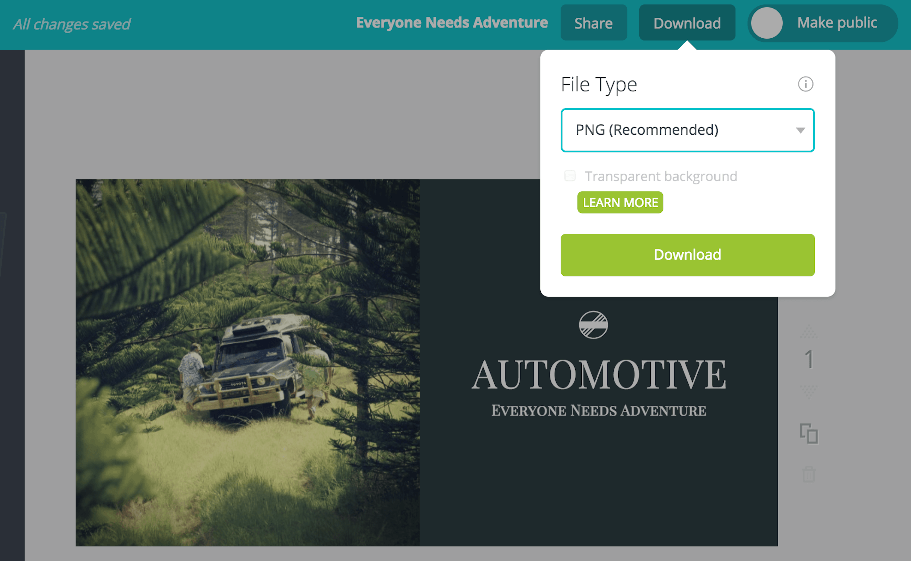
Once you’ve completed your design, download it by clicking the ‘Download’ button at the top of the Canva editing window.
Summary
When creating a Facebook ad design, there’s a lot to take into account.
So, take all the time you need.
And don’t be afraid to get creative and try things out — you never know what you might come up with!
Remember, your design must:
- Be relevant to your target market
- Stand out to catch user’s attention
- Have a clear value proposition
- Include a single call-to-action
Congrats, you now know how to create a killer Facebook ad design!
Who needs skills like Picasso anyway?
Do you have any questions about creating a Facebook ad design? Let us know in the comment section below – we read all of them!
