Whether you’re looking for inspiration or a new trendy outfit to wear, there are countless amazing fashion websites to browse through for inspiration. From women’s fashion websites to men’s, there’s a whole range of ideas and tactics used to create such an iconic fashion brand. In this article, we’ll share some trendy fashion websites (along with the best fashion websites) that you can learn more from as you build a fashion store of your own.
Post Contents

Don’t wait for someone else to do it. Hire yourself and start calling the shots.
Get Started FreeWomen’s Fashion Websites
Lulus
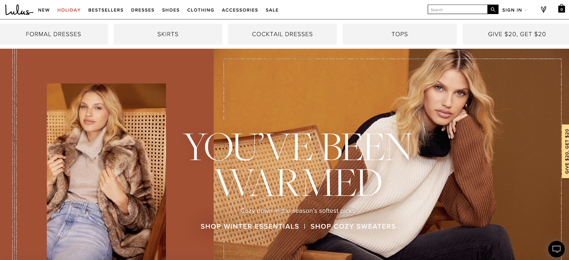
Fashion websites like Lulus deliver an exceptional online experience to customers. Their website is filled with playful copy, colorful and large images, and a user friendly website design experience. During seasonal events, there are collections added for women’s clothing for that event such as Holiday at Christmas.
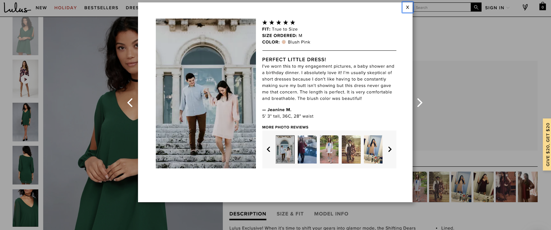
Their product page is always exceptional for the customer. If you try to order a size but it’s sold out, you can send your email to be notified when more returns to stock. (And I’ve received an email for a back in stock item so they really do send it). But their Fan Photos/Customer Reviews are my favorite. Seeing how other customers in different sizes or different colors look in the product can really help you envision what you’ll look like as well. And it even lists the size customers ordered to help you see what it looks like on different body types. As with other fashion websites, there’s even a complete the look section which typically includes the accessories the model is wearing but sometimes offers other suggestions to create a stunning outfit.
Fabletics
Fashion websites such as Fabletics center around a personalized experience for the customer. Before you can even see the collection of products, you’re required to go through a quiz asking questions about which compression level you prefer for your apparel, high rise or mid rise preference, length of leggings, color preferences, and more.
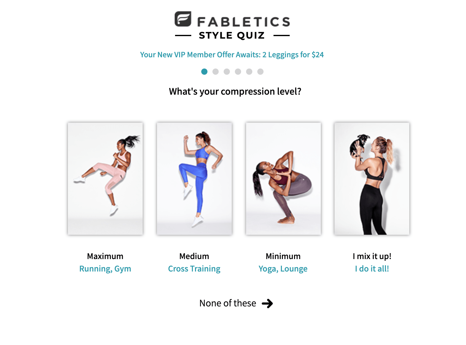
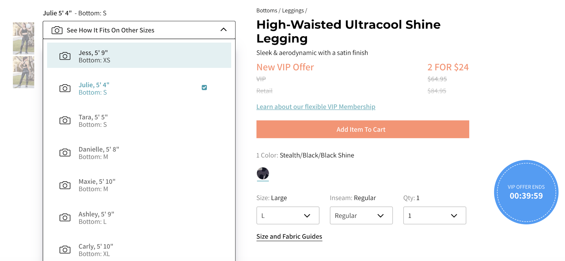
After filling out the personalization quiz, you’ll be shown items in your clothing size automatically. But you’ll still have the option of buying items in different sizes in case you plan on buying for a friend. When you head over to the product page, customers are able to select different models for the main picture. For example a 5’9” model wearing a large or a 5’4” model wearing a small.
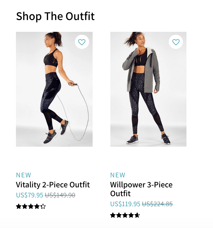
Fabletics also has a Shop the Outfit section which allows customers to buy the whole outfit set rather than just the leggings. This feature on the women’s fashion website helps the brand increase their average order value so they can generate more sales from a single customer.
Ann Taylor
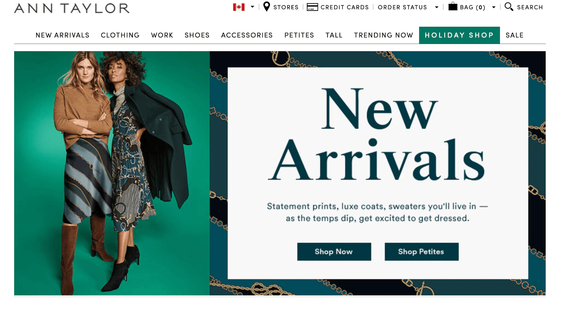
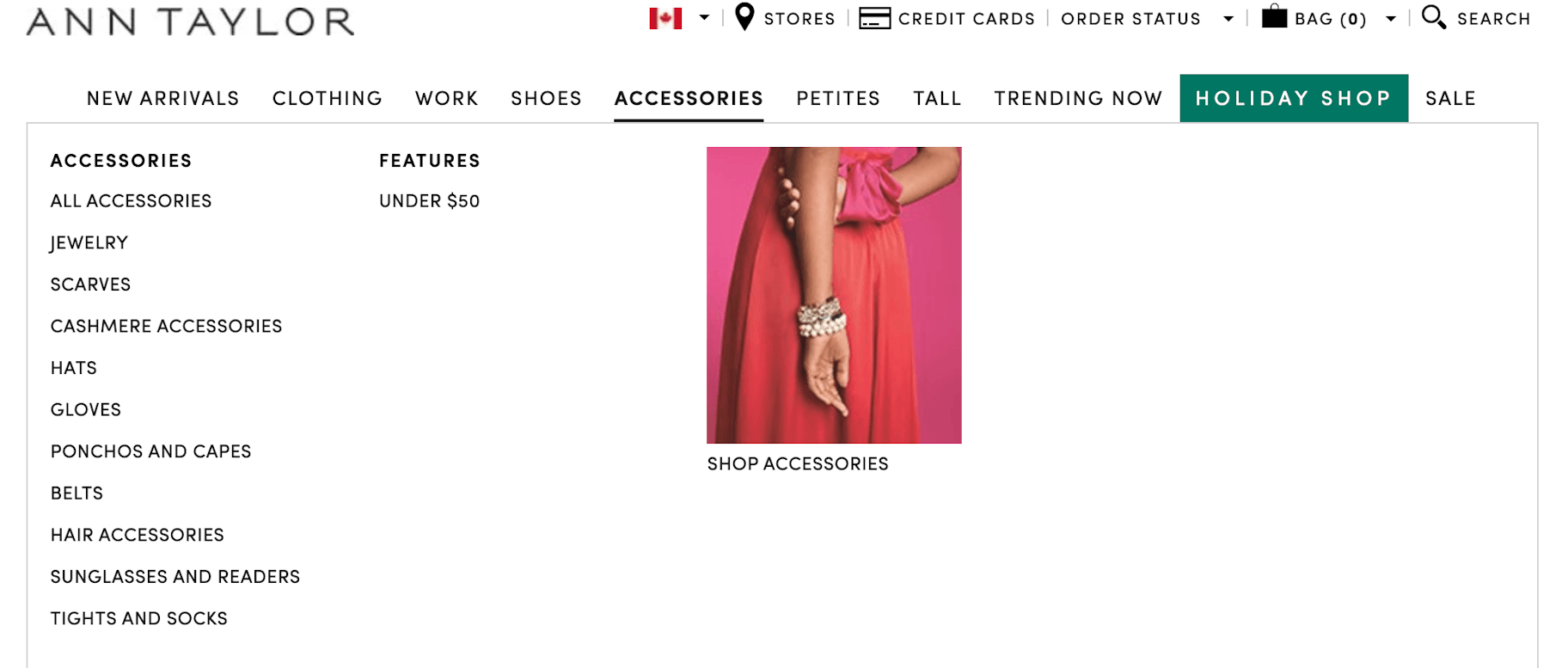
The fashion website Ann Taylor has a great customer friendly top navigation menu. It in, it includes “New Arrivals” (so customers can find the latest products), “Petites” and “Tall” so that customers with different body shapes can find the right products, and even seasonal products with its “Holiday Shop.”
The drop-down from the top navigation goes into even more detail. This helps customers better navigate the fashion website so they can find exactly what they’re looking for. There’s also an ‘Under $50’ section for customers looking for more affordable products to buy.
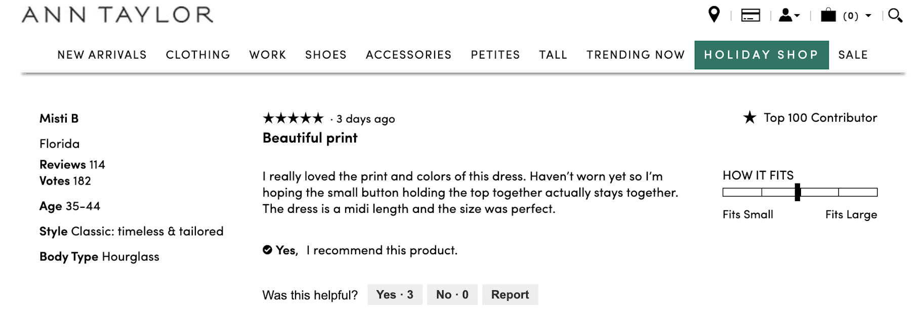
On the product pages, size charts are included in all drop-down menus. And they also include sizing for petite and tall so that every body type can find the corresponding size chart that best suits her. The page also includes reviews which also include a woman’s age so if you’re buying a gift for a person in a specific age group, it can help to know if the outfit is right for her. The review also includes body type so that you can understand which body frame the outfit would look best in.
Men’s Fashion Websites
Jack and Jones
Jack and Jones’ fashion site puts an emphasis on discounts to generate sales. They use an exit intent pop-up to offer a discount to customers who sign up for their email list. They also include a “Solid Deals” section which includes their discounted and bundled offers to generate higher average order volume and more sales.
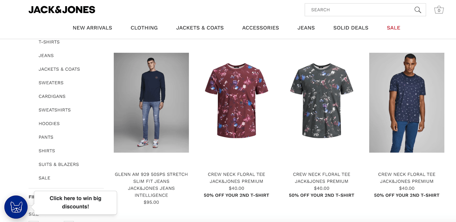
On this fashion website, you’ll also find a section on “Wholesale Inquiries” this allows Jack and Jones to also benefit from B2B ecommerce rather than B2C. Thus, expanding their sales and customer base for orders online.
Harry Rosen
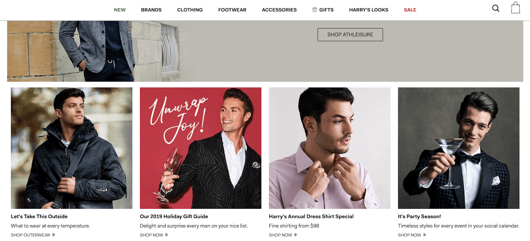
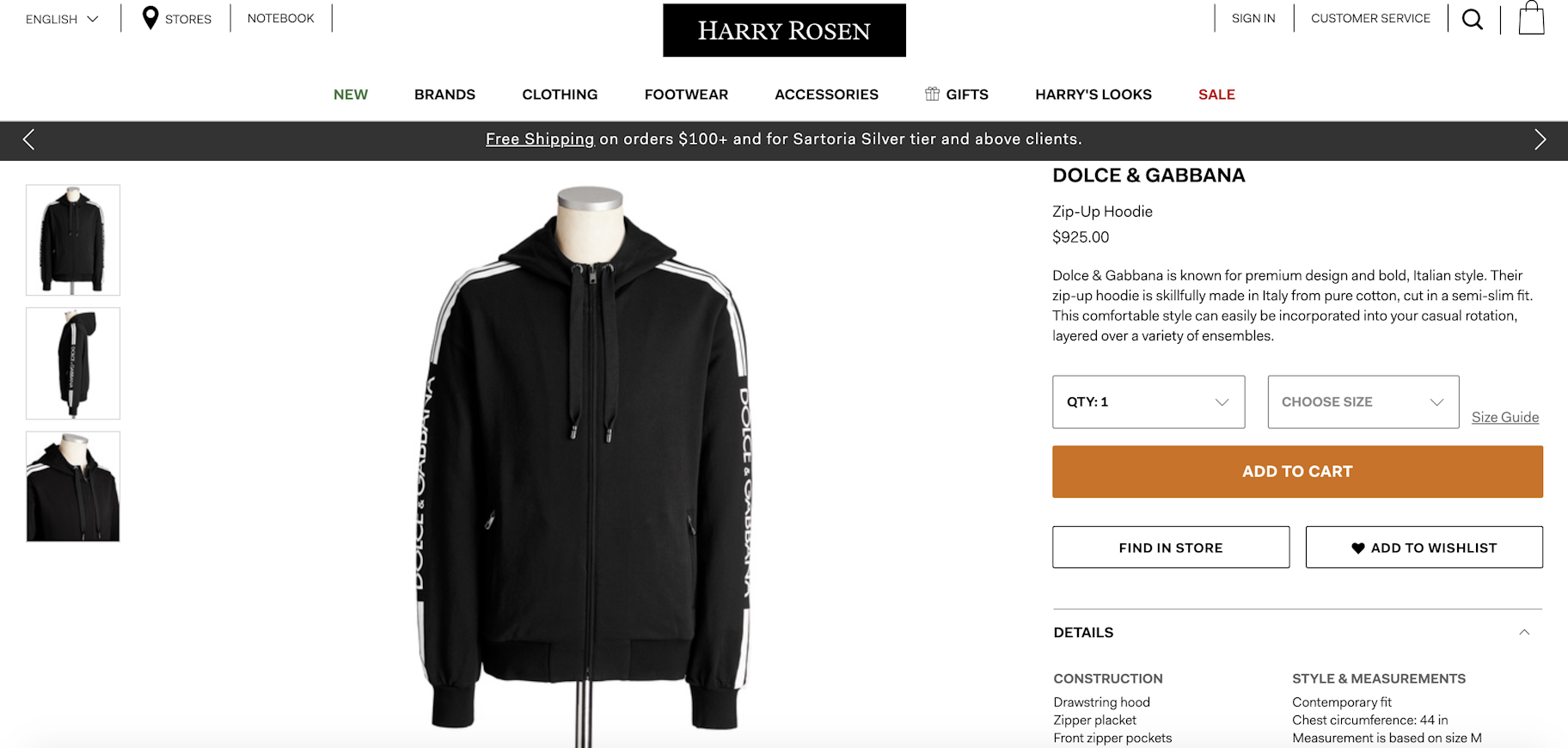
The fashion website Harry Rosen puts the focus on shopping online, on their homepage, with multiple “Shop Now” links. There are eight Shop Now links on their homepage alone. They all lead to various product collections.
When landing on a product page, you’ll find that the copy is written to appeal to a higher end clientele as the focus is on keywords like “premium” and “skillfully made” which are keywords you don’t often find on your average online store. And with a steep $925 cost for a zip-up hoodie, it’s clear that the copy is intended for a higher end customer.
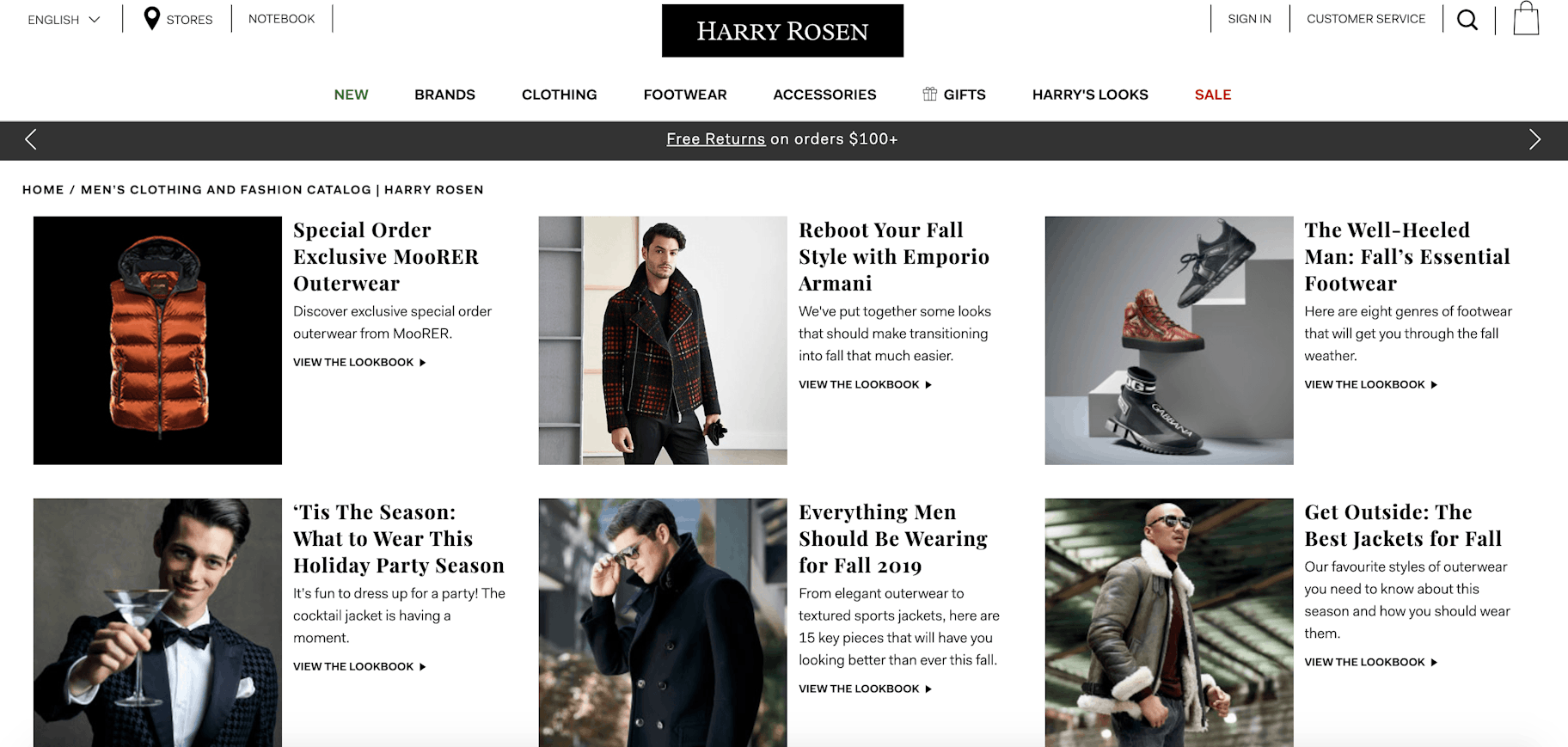
Another notable feature about this fashion site is that it includes a blog. Their blog is focused on fashion lookbooks which include different men’s fashion styles with Harry Rosen’s menswear. This can help increase average order value by showing all the pieces that make one complete outfit.
TopMan
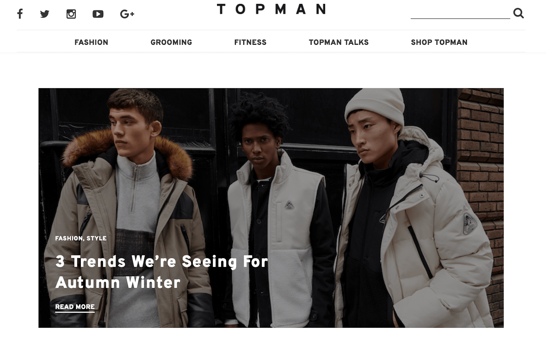
Fashion websites like TopMan increase their website traffic with the addition of a content-based blog. Multiple times per week, they publish new content to attract traffic to their website from search and social. This likely helps boost their domain authority so that more people can find the products they sell on their website.
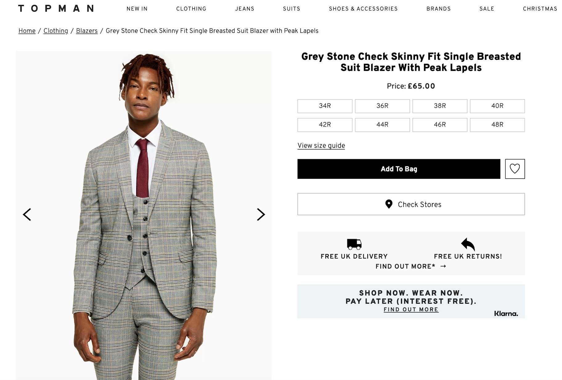
This fashion website’s product page includes a shop and wear now and pay later feature. This tends to be popular on sites where average order value is high or product cost is high. Thus, allowing people who can’t pay in full immediately an opportunity to buy now and pay in installments or at a later date. The black call to action button offers a striking color contrast against the white background which puts the emphasis on customers to “Add to Bag.”
Maternity Fashion Websites
PinkBlush Maternity
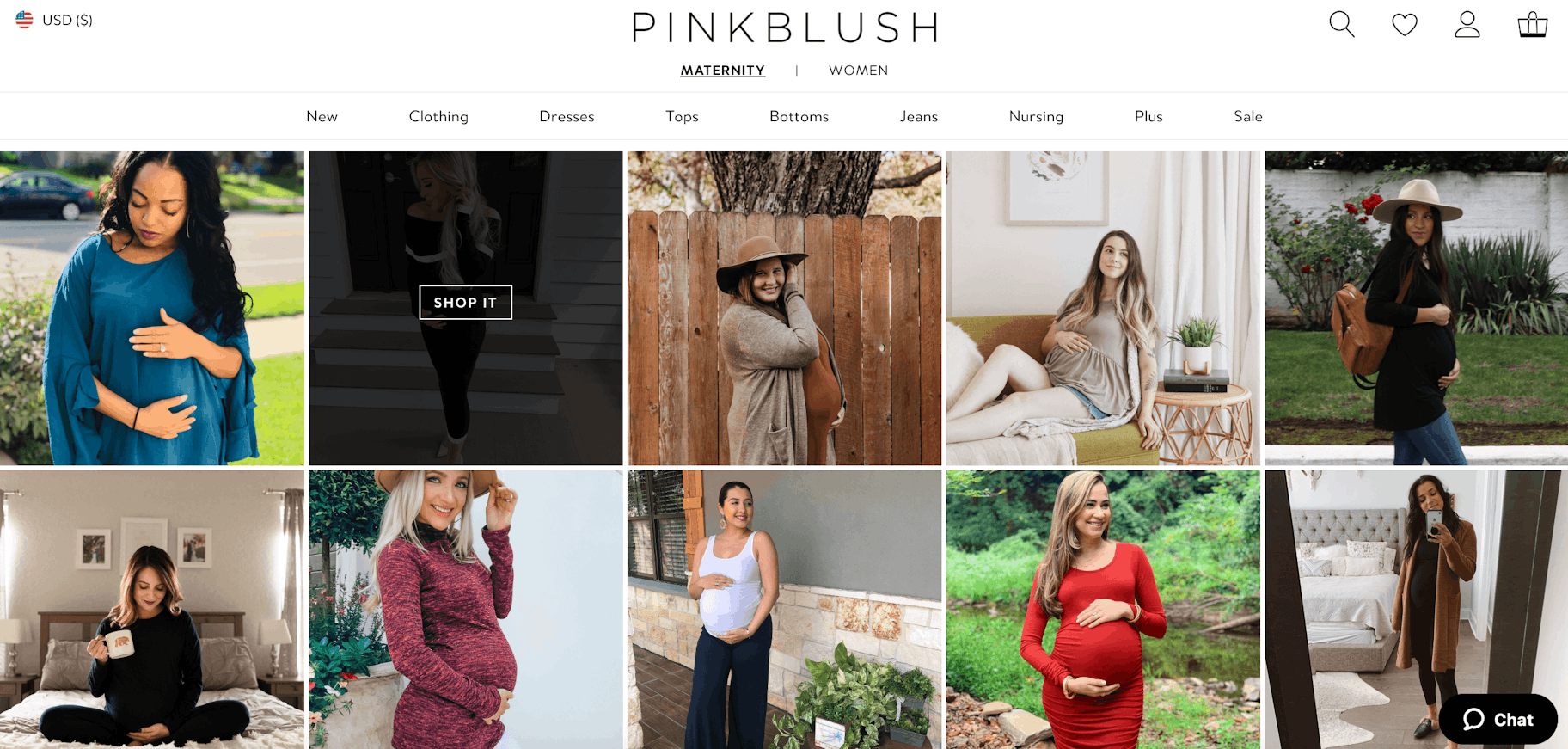
PinkBlush Maternity’s fashion site puts the emphasis on social proof. Their homepage includes countless images from customers pulled from their Instagram account. Customers are able to shop the look directly from the customer photo they see making it a smart marketing move from PinkBlush.
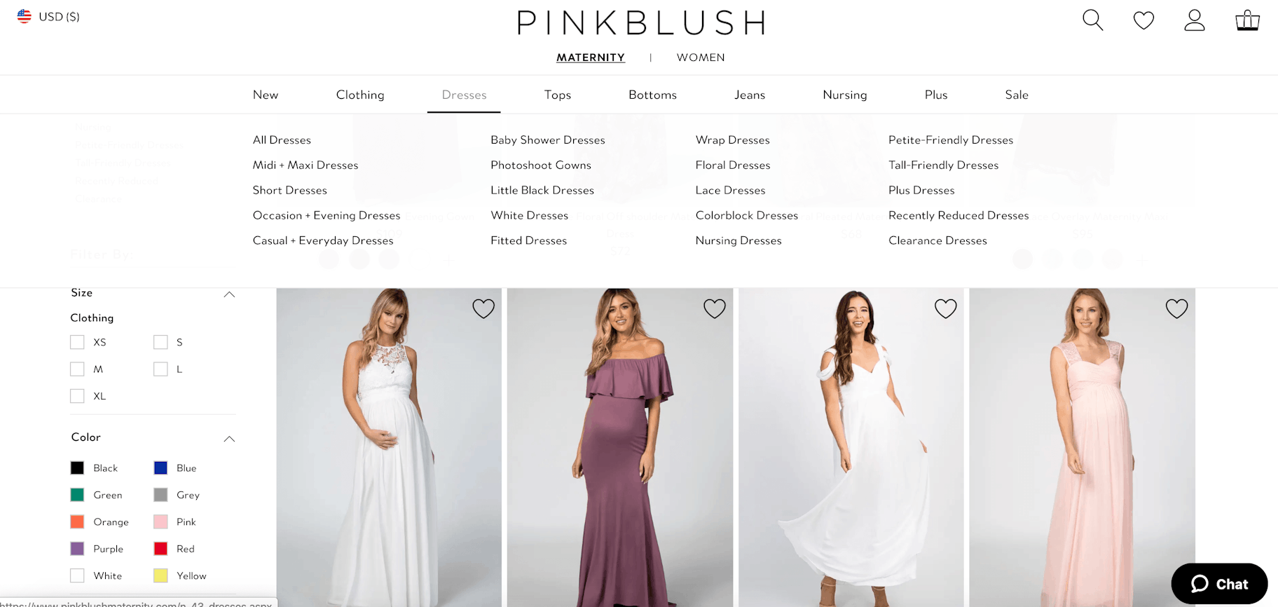
Notably, PinkBlush’s product collections are also very modern. They include categories such as “baby shower dresses” and “photoshoot gowns.” They’re aware that people don’t just shop based on the length of a dress but also the occasion. Since their biggest audience is on Instagram with over 440k followers, it’s likely that they’re aware that pregnant women are constantly posting photoshoots with their baby bump. So having a collection for that as well shows that they’re ahead of the trend.
Motherhood Maternity
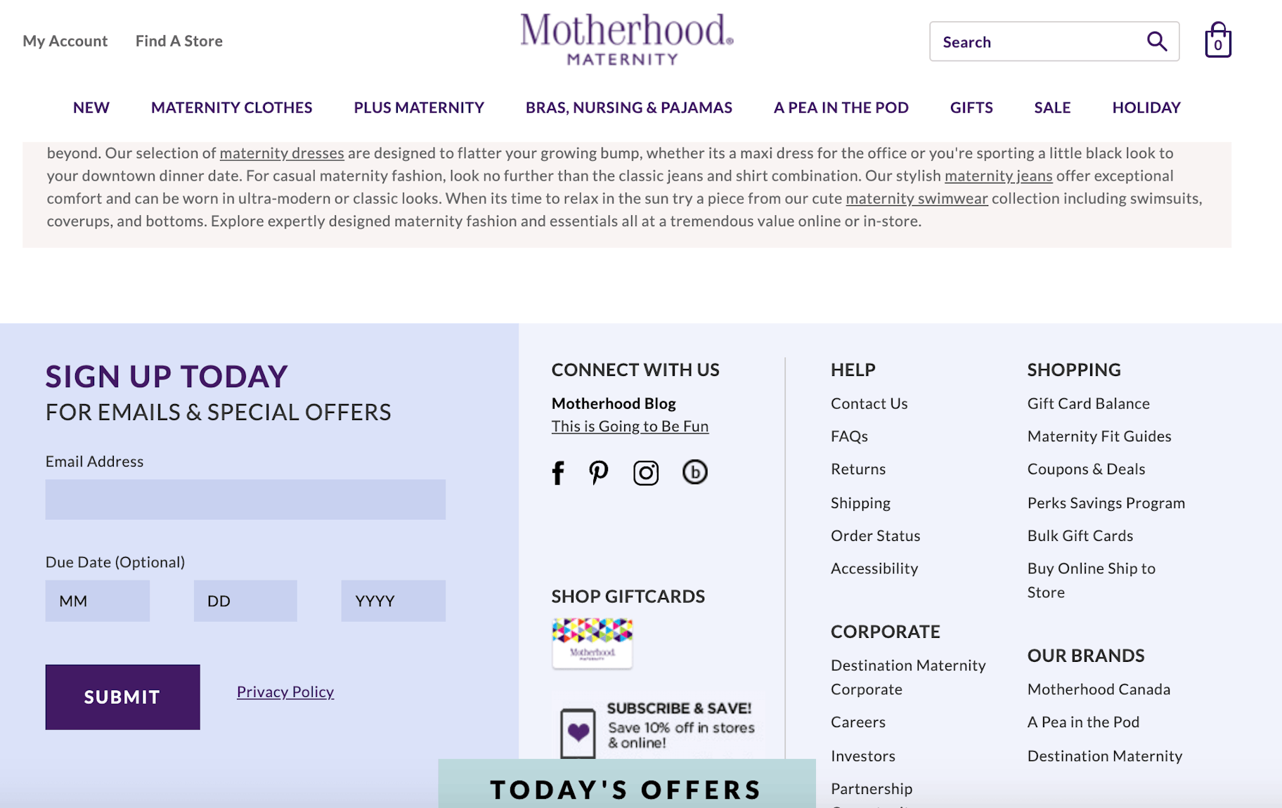
Motherhood Maternity’s fashion website puts a focus on marketing. Their email list opt-in form asks for a due date so that they can better understand the lifecycle of the customer. For example, a woman who is only a couple months pregnant will likely get more value from their emails than someone who gave birth four years ago. Their footer also includes “Today’s Offers” which includes the discounted product collections and savings a customer will find on their store.
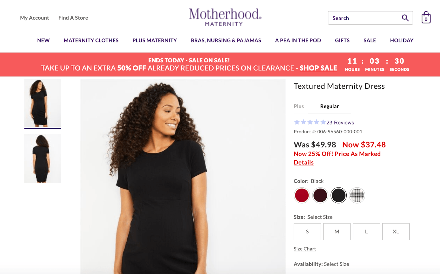
On their product page, customers will continue to see the marketing focus. With a countdown sale banner on the top of the page, an element of urgency is added to compel customers to buy now. A red font is used to highlight the discounted savings of the clothing to add another captivating reason to get customers to pull out their credit card and shop now.
Children’s Fashion Websites
The Children’s Place
Upon arrival of the children’s fashion website The Children’s Place, you’ll see a clear emphasis on marketing. A discount offer pops-up offering $10 for signing up to their email list. Their homepage calls out Air Miles offers, earning Place cash for spending on their fashion website, free shipping offers, and more. It’s a bit over the top but it’s impossible to miss all their offers. It’s also important to note that the children’s fashion niche is one of the hardest niches as retention is low as children eventually grow up. Maintaining a customer base is usually short-term. So, it’s understandable that they’re trying to convince people to shop with them.
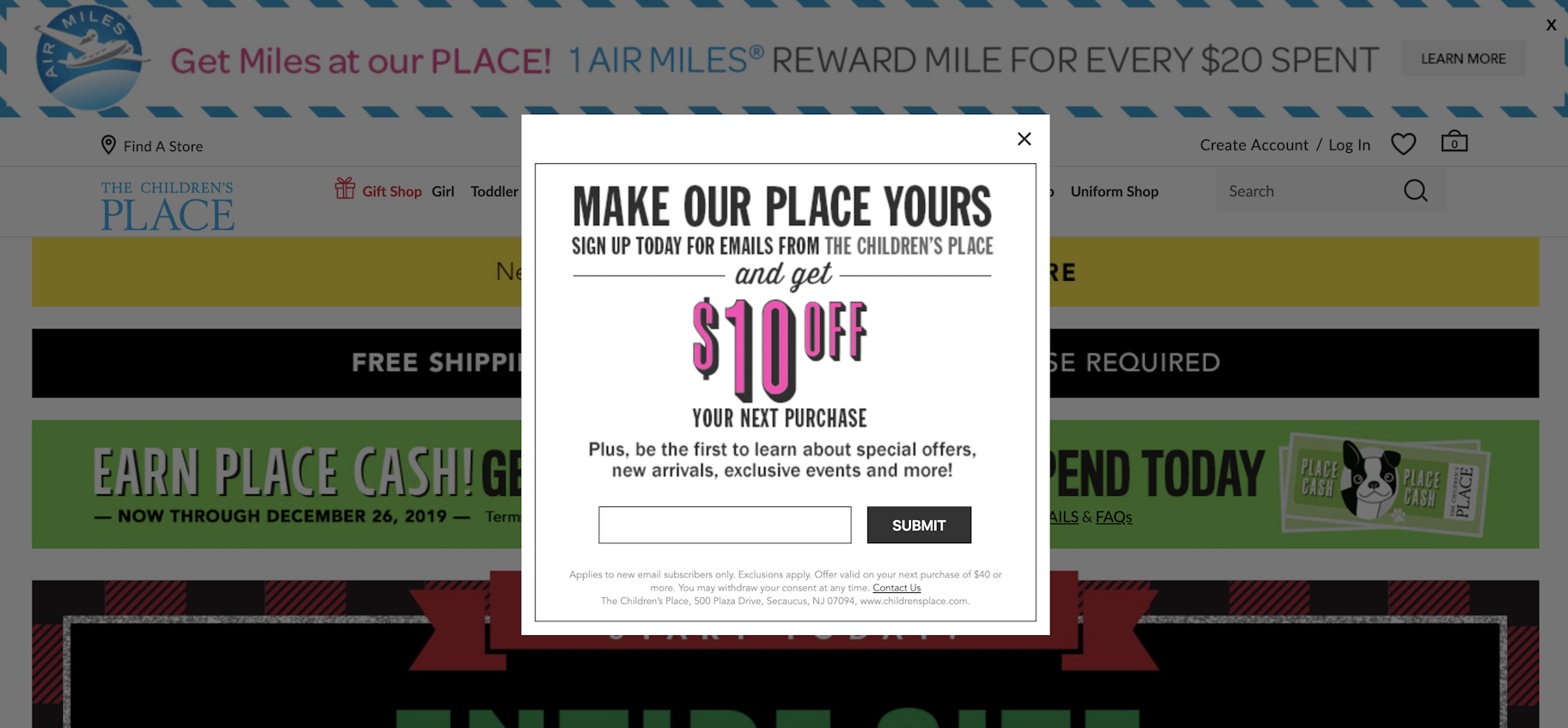
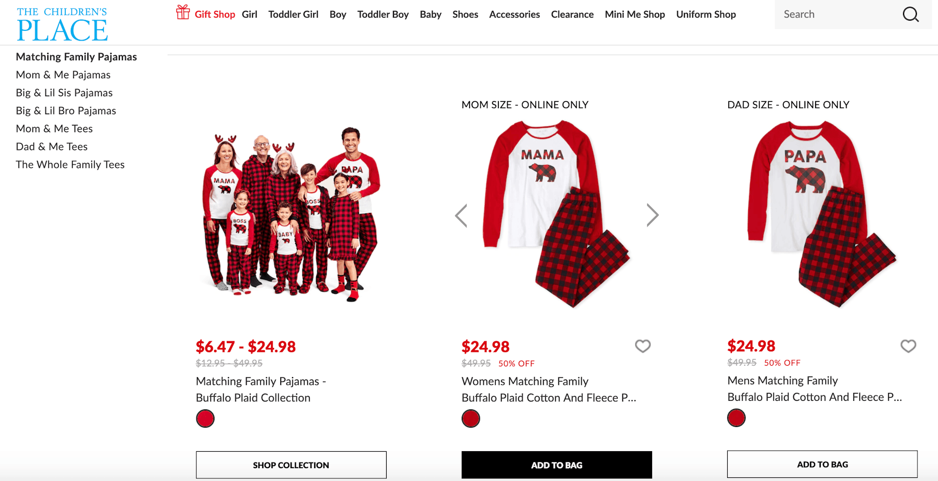
Their top navigation includes collections for baby, toddler, and children so that they reach the entire youth base. They also include clothing for adults by having a Mini Me section which tends to be popular in the Instagram world where parents want to wear matching outfits with their children. It’s a smart expansion into adult clothing in an organic way that makes sense with their children’s brand.
Oshkosh B’Gosh
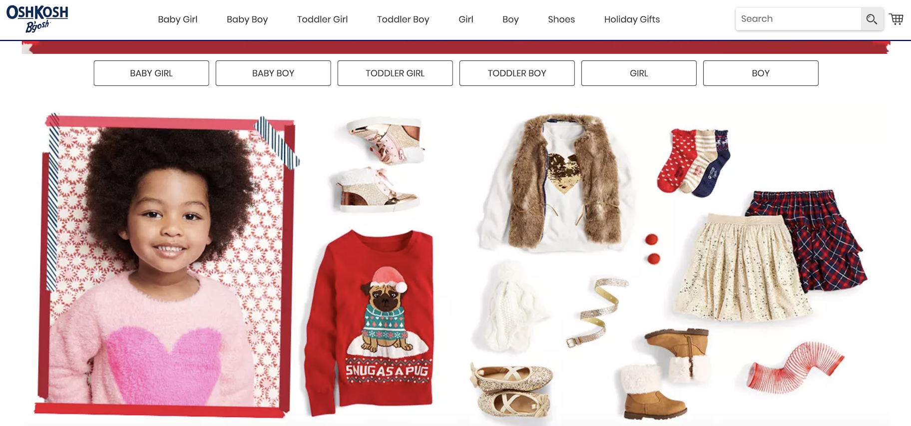
OshKosh’s fashion site puts the emphasis on their navigation. At their top navigation, they include the age group for babies, toddlers, and children. As you scroll through the homepage, the product collections from the navigation continue to appear with every new banner. This puts an emphasis on getting customers to shop on their website.
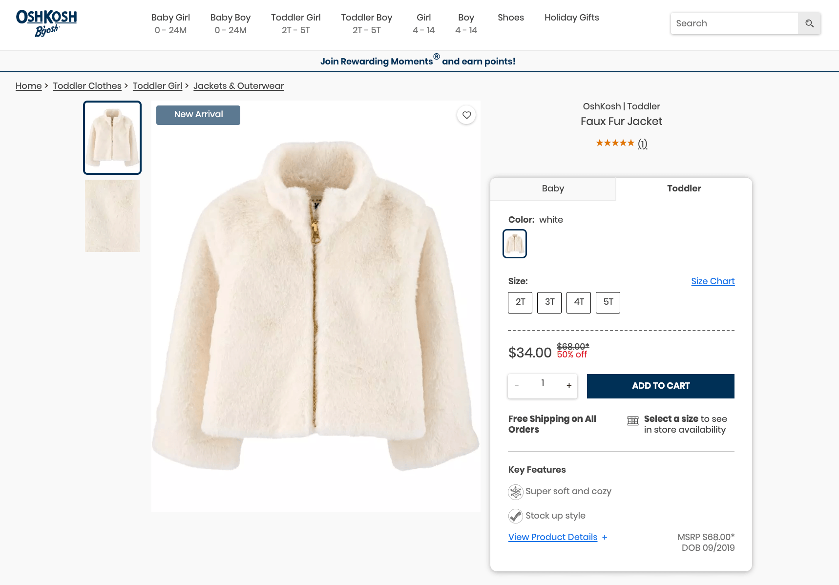
Their product page details the key features and allows for zoomable picture previews. Copy needs to be expanded. This is likely done to put a greater focus on the call to action “Add to Cart” so that people don’t get distracted on the page. The content is still there but customers need to actively click on it to see it if they aren’t ready to buy.
Fashion Websites on Shopify
Suzy Shier
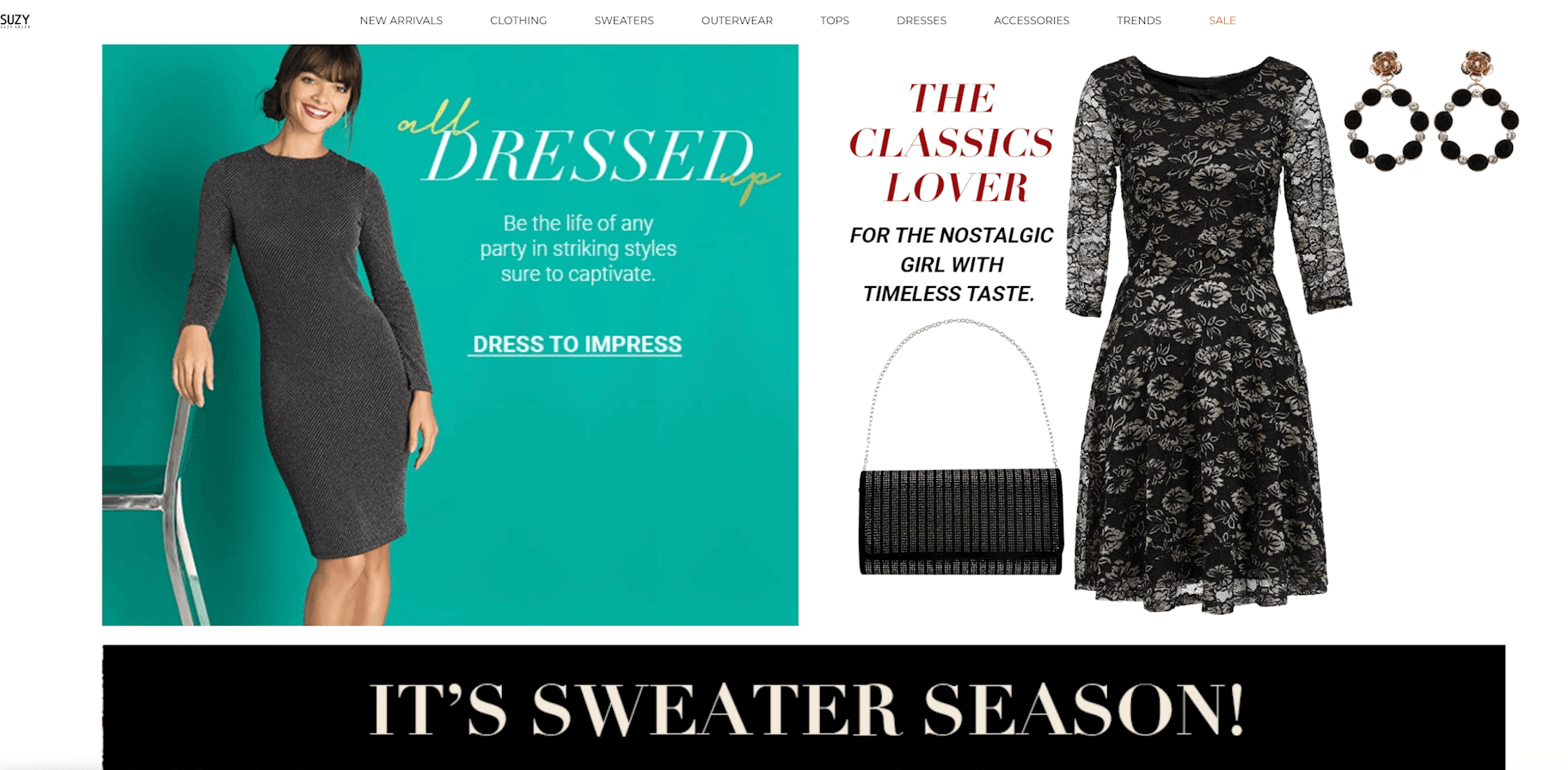
Suzy Shier’s fashion website calls out different product collections on their homepage. The homepage is often the most visited landing page for a site so it makes sense that Suzy Shier would create banners for their dress collection, sweaters, and more.
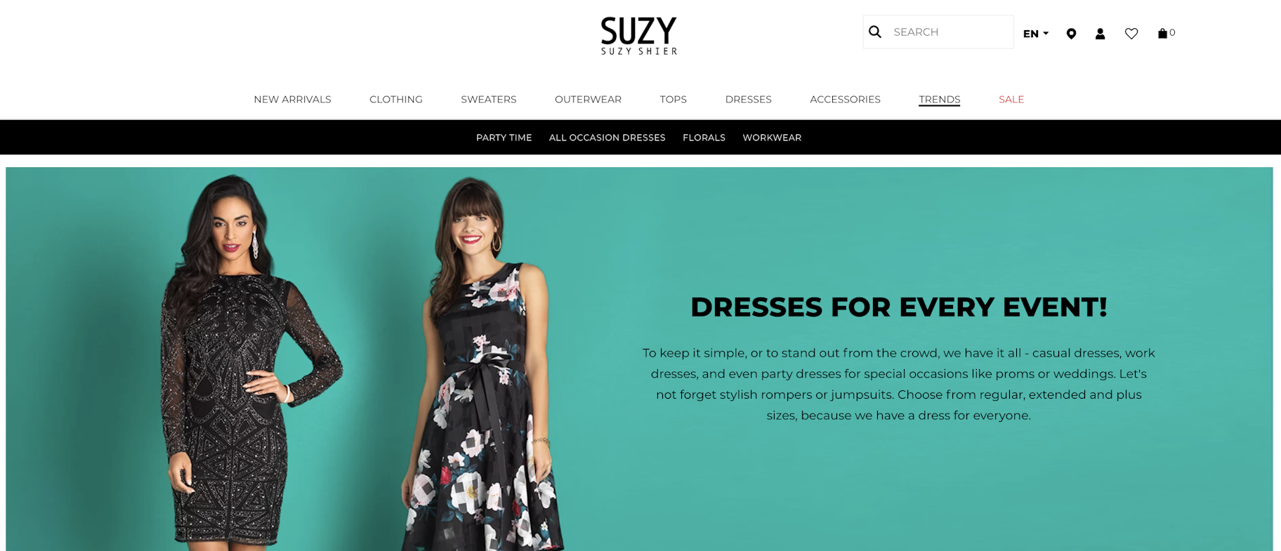
One of the best collections on their website is the Trends feature. The trends listed change each season. Right now, they’re Party Time, All Occasion Dresses, Florals, and Workwear. It’s likely that since the holiday season is here, there’s an influx in searches for holiday and New Year’s dresses so the trends collections accommodate those searches.
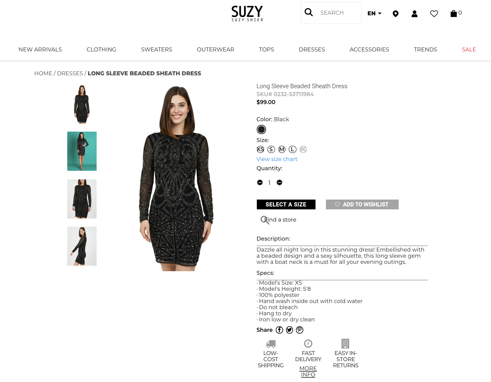
On the product page, you’ll find trust badges, captivating copy, clothing specs, and a zoomable picture.
Mizzen and Main
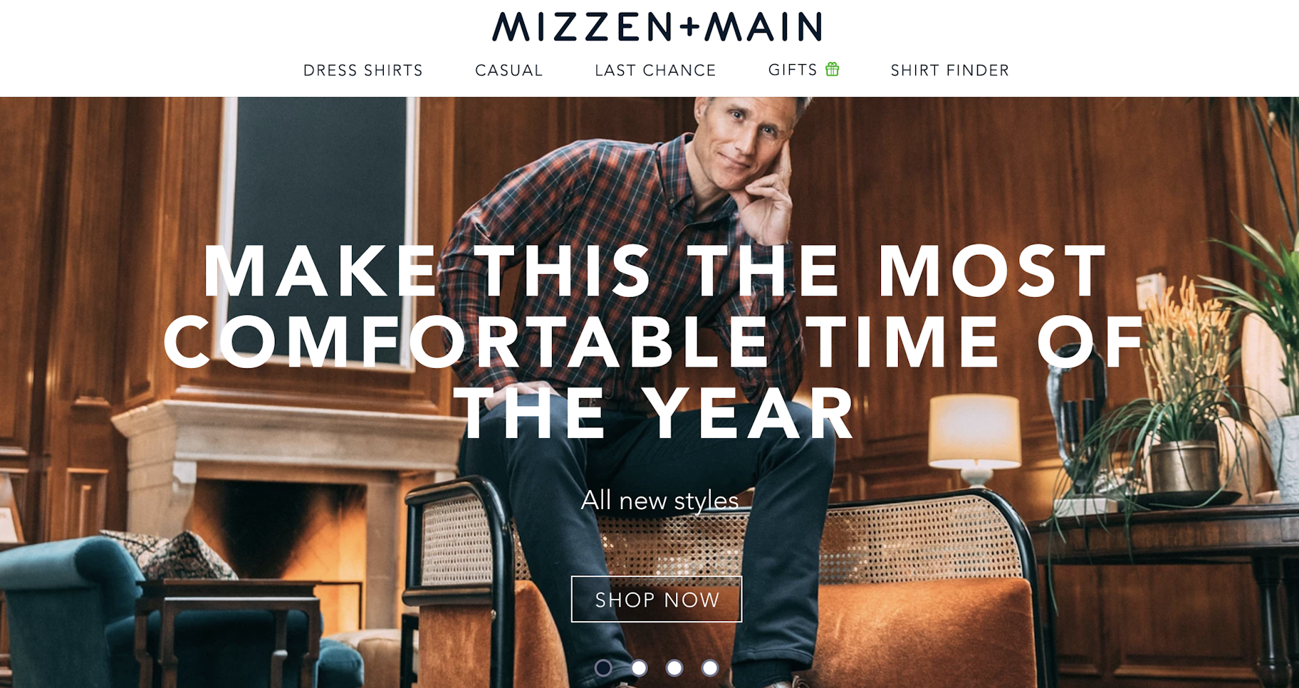
Mizzen and Main’s trendy fashion website has a clear, singular focus: comfortable menswear. They have four rotating banners which use the word comfort or some variation on their homepage. By repeatedly communicating this messaging, it helps customers associate the Mizzen and Main brand with comfortable clothing.
The comfort messaging continues onto the product page where you’ll find copy about ‘breathable comfort’ in the description. The rest of the copy also matches the comfort branding by mentioning keywords like ‘super soft’ and ‘lightweight.’
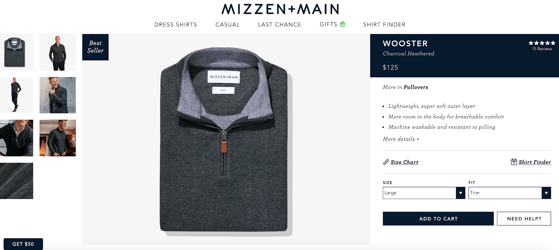
Overall, this is a great fashion inspiration website for those looking to find ways to articulate their branding throughout their website consistently and simply.
Gymshark
Gymshark is a Shopify fashion website that puts the emphasis on strong people. In all their graphics, you’ll find muscular and athletic people in all photos to create a consistent brand image for their fitness apparel brand.
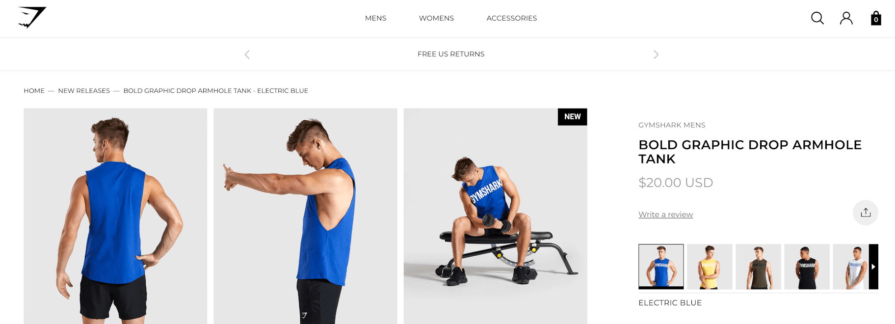
Their products all include their brand name on the clothing so that people associate Gymshark with strong people. In their early days, they would reach out to bodybuilders and offer free clothing and those bodybuilders would post videos and pictures wearing the Gymshark brand.
In Conclusion
The fashion websites on this list are only a few of the many great brands you can use as inspiration as you build your own site. From top navigation to product pages to branding, there are countless things to think about to complete the look and theme of your very own fashion brand. You can use Oberlo to find amazing women’s, men’s, children, and maternity clothing to create a fashion website of your own. So, if fashion is your passion, start your own online store today.
Want to Learn More?
- 10 Best Women’s Clothing to Sell
- 10 Best Men’s Clothing to Sell
- How to Start Your Own Clothing Business
- The Ultimate Guide to Starting a Women’s Clothing Brand
