Think back to the last item you bought online.
Why did you make the purchase? What convinced you to choose that website and product over the dozens of other options you likely had?
We’d wager that a lot of your decision was based on the product page alone.
That’s because it’s arguably the most influential page in getting your visitors to convert.
In a way, product pages are like salespeople in a retail store. They allow to you make a compelling argument for your product and answer any questions the customer might have.
It would be silly to have a retail store without good salespeople – so why risk building an ecommerce store without creating good product pages?
Plus, when you start running ads on Google or social media sites like Facebook and Instagram, you’ll direct traffic to straight to each product’s corresponding product page. This means you won’t be able to rely on brand-building from your other pages.
So what makes a “good” product page?
At the end of the day, it should check off a few boxes, like:
- Giving shoppers an accurate, vivid, and detailed look at the product
- Showing (not just telling) them how the product solves their problems and improves their life
- Instilling trust in various ways, from a clean design to robust information to social proof
- Delivering on its promises – in a straightforward and convenient way
There are infinite ways to fulfill these crucial requirements, but the keys lie in your overall product page format, as well as details like your product descriptions, images, and videos.
In this ebook, we’ll dissect these elements, give you best practices and tips for your own store, and show you loads of examples from brands that are doing it right.
Shall we?

Don’t wait for someone else to do it. Hire yourself and start calling the shots.
Get Started FreeTypes of product pages
Before we get into the nitty-gritty of what a product page typically looks like, let’s go over two different types of product pages: the product landing page or ecommerce landing page and the product listing page.
Product detail page
The product landing page, also known as the product detail page, will be the key focus of this ebook. It’s a showcase for a specific item in your store. It shows all the details a visitor needs to know before deciding to buy.
At the very least, your product landing page should include a strong description, quality photos and/or a video, and a smooth pathway to purchase.
Allbirds has beautiful, sleek, and informative product landing pages.
For each shoe and its color variation, the website shows multiple close-up photos of different angles and a video of a model wearing them.
The above-the-fold descriptions are minimal, but Allbirds makes up for it with plenty of additional info underneath.
It shows the company’s Instagram feed, an explanation of their materials, a diagram showing the anatomy of each shoe, some key benefits, and customer reviews.
Product listing page
A product listing page (a.k.a, a collection page) is an aggregation of several products. It should show a thumbnail image of each product, its name, and its price.
It might include other details like a star rating, availability, or item variations.
Typically, a product listing page will show all of a store’s inventory, or listings by category.
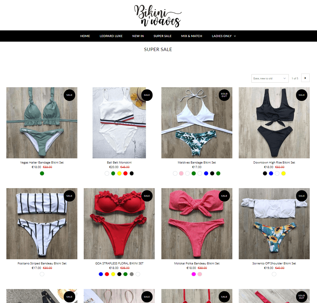
Shopify store Bikini N’ Waves has a product listing page for each of its main navigation categories.
The site includes each product’s thumbnail, name, price (both original and sale price, if applicable), and colored small circles that visitors can hover their mouse over to look at photos of an item’s color variations.
Including a product listing page is a pretty standard practice, and one we absolutely recommend for your store.
It lets your site visitors browse through your offerings and get a general feel for your inventory.
Ain’t nobody got time to click through each product page individually when they’re not even planning to buy anything yet.
Anatomy of a product page
A strong product page checks off eight boxes:
- Important product details, like the name, price, and customization or variant options (like colors and sizes).
- A product description that highlights the product’s features and how it solves the visitor’s problems, needs, or desires.
- A high-quality “featured image,” or a large photo of the product.
- Additional images that the visitor can click through to get a better visual idea of the product’s size, texture, and use.
- A big, shiny call-to-action (CTA) button for the customer to add the product to their cart or pay now.
- An intuitive, easy-to-navigate layout, which typically shows the product photos on the left side of the screen and the product details and buy button on the right side.
- Social proof, like Shopify product reviews, product testimonials, or trust badges, to instill confidence in your brand and products.
- Product recommendations to cross-sell and boost the visitor’s total order price.
Time for an anatomy lesson to show these in action.
We’ll look at a Shopify product page for skincare company Bliss.
Product name
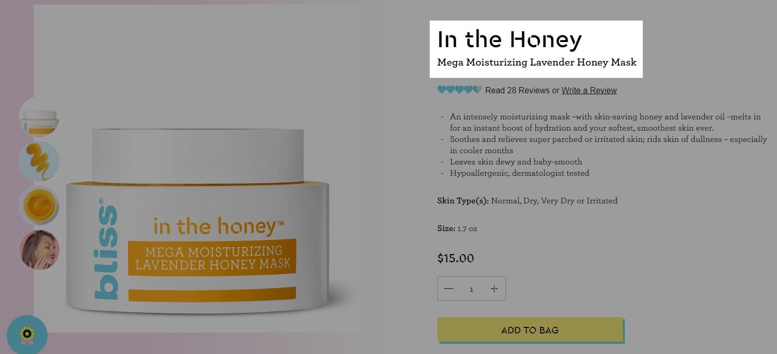
The product’s name, “In the Honey” is large and easy-to-read, and written in the company’s branded font. A short phrase underneath tells the visitor exactly what it is and what it’s for: “Mega Moisturizing Lavender Honey Mask.”
Social proof
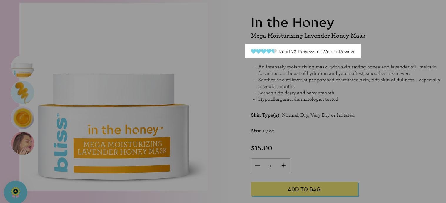
Social proof in the form of product reviews gives visitors the opportunity to see how other customers have liked it. Product testimonials can convince potential customers to purchase your products. When users click this section, they’re taken to the bottom of the page to see all the Shopify product reviews.
You can do this easily on your own store with Shopify product review apps like Testimonials + Product Reviews, Comments, Ratings, + Reviews, or Loox Photo Reviews.
Product description
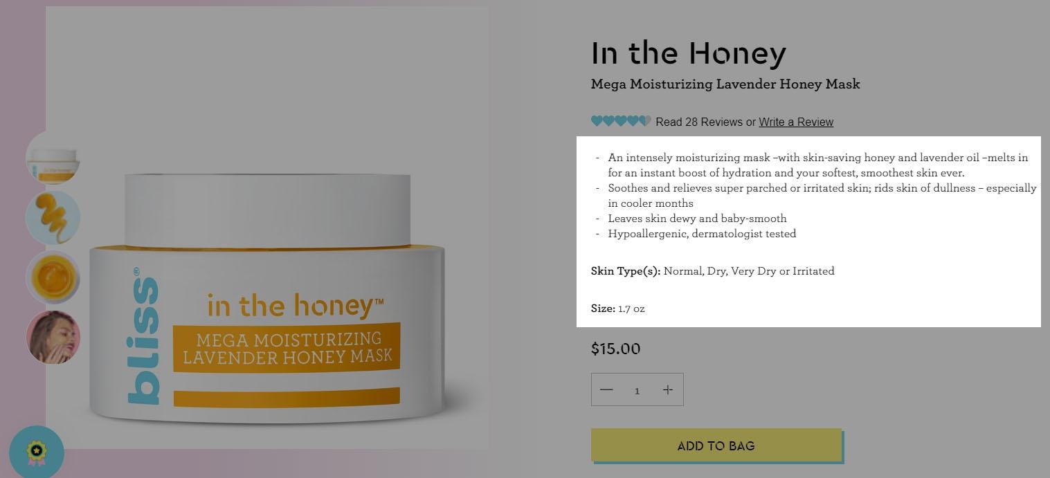
The product description uses bright and vivid language to paint a picture of what the product does for customers. It’s an “intensely moisturizing” mask that gives an “instant boost of hydration.” It “soothes and relieves super parched or irritated skin” and “leaves skin dewy and baby-smooth.”
Bliss also lists important details – it’s hypoallergenic and dermatologist tested, made for normal to very dry skin, and comes in a 1.7 ounce jar. There’s no question about who this product is made for (someone with dry skin) and how it can help solve that person’s problem (moisturize, hydrate, and soften it).
Price, quantity, and buy button
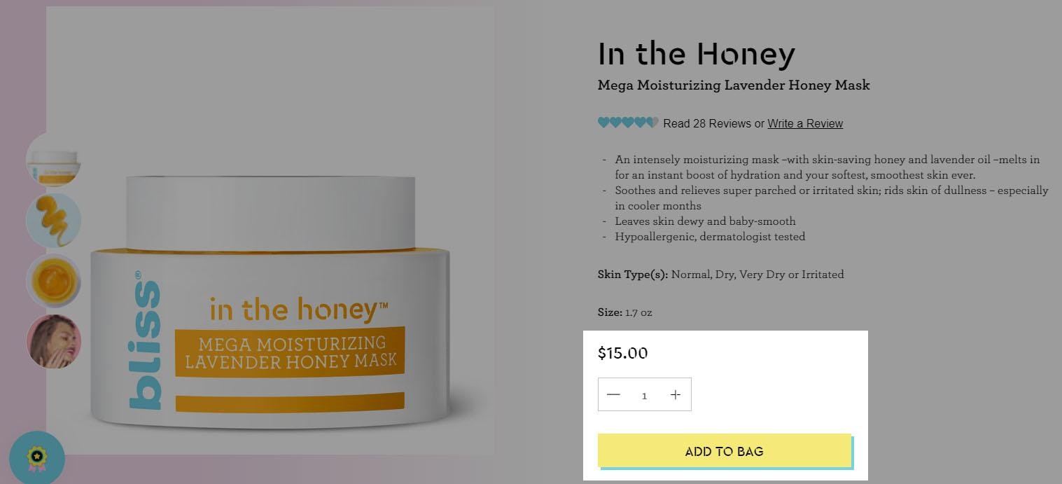
The price is easy to read. The quantity selector is directly underneath, so visitors can choose how many they want. Then straight to the “Add to bag” button – which is yellow to ensure that it sticks out from the other items on the page.
In addition to being noticeable, color psychology says that yellow is associated with emotions like happiness, positivity, and optimism. We’ll look closer at color psychology later in this chapter.
Featured image
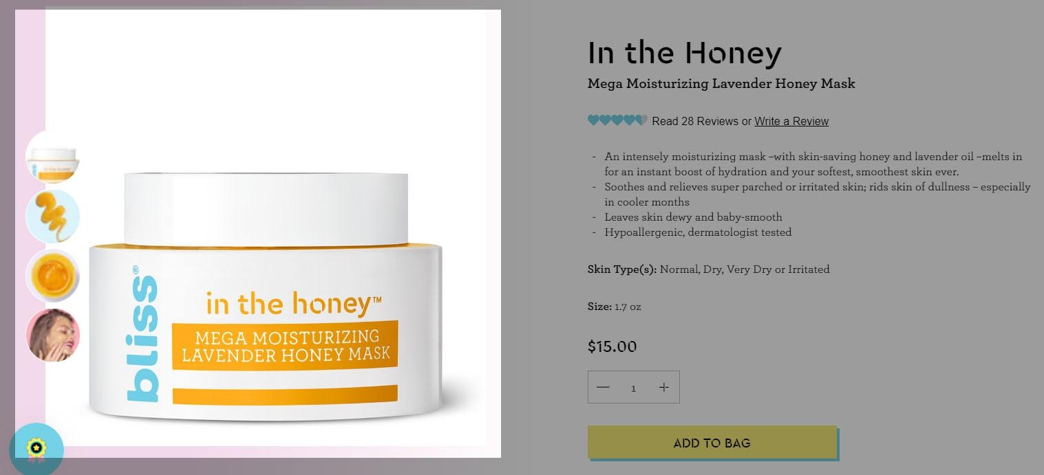
The featured image on this product page shows the jar, and supporting product images allow the visitor to see what the texture looks like inside and outside of the jar, as well as what it looks like on someone’s face. This is important for a beauty product, as customers want to know what they can expect – especially when they’re going to smear it all over their skin.
Supporting images and video
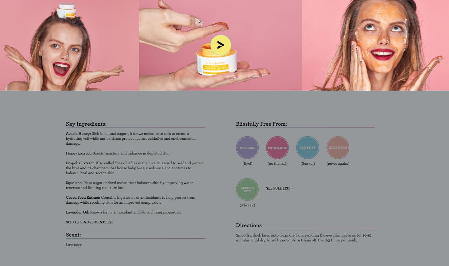
When you scroll “below the fold,” you see more photos of the product in action, as well as a quick 10-second product video popup from the Bliss YouTube channel that shows the model applying the mask and goofing off.
It’s actually several photos edited together – just another testament that product videos don’t have to be high-budget productions to serve their purpose and boost your brand’s vibe.
Additional product details
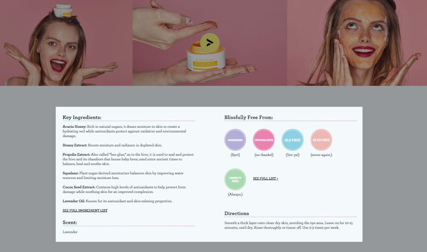
Under that, you see more product details: the ingredients, the allergens and irritants it’s free from, and directions for use. With the “Blissfully free from” section, Bliss makes a great move: in today’s world of skincare, there’s a large group of customers who are aware of buzzwords like “parabens” and “sulfates.”
They don’t like these by-products and they want to steer clear, making this section a welcoming beacon for the right visitors.
Product recommendations
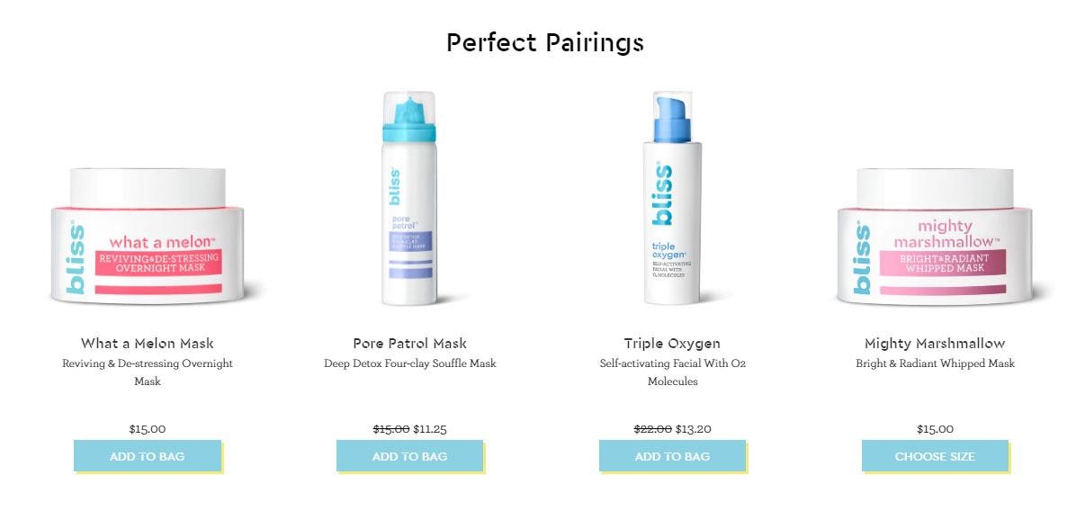
The “Perfect Pairings” section is a glorious cross-selling opportunity. The name of the game here is increasing your average order value (AOV), or the average dollar-value for each customer’s order.
Tactfully recommending best-selling related products is one of the smoothest paths to a higher AOV. Take a look at Shopify product page cross-selling apps like Frequently Bought Together, Personalizer by LimeSpot, and Bold Upsell.
Customer reviews
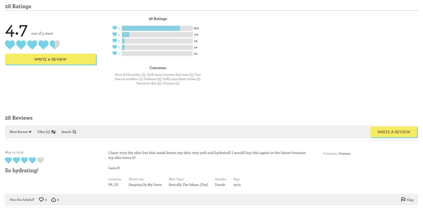
In the last section, you can read the customer reviews that were teased under the product’s name at the top of the page. Bliss even adds some customization by letting reviewers fill out some personal information like their location, skincare knowledge and habits, skin type, gender, and age range.
This gives visitors some more context into whether or not the product review is relatable and relevant to their own traits and lifestyle – which helps to solve one of the biggest issues with beauty product reviews.
Extra credit tips
In addition to what we’ve discussed, there are a few other product page tactics that can help you get more sales and higher customer loyalty.
1. Create a sense of urgency or scarcity
Nothing encourages an impulse buy like a limit on time or inventory. Urgency and scarcity tactics can help your Shopify product page perform better by motivating customers to buy instead of think.
You can do this in several ways, like showing which items are out of stock or size. This works well in the fashion niche. You can also host flash sales and other limited-time offers.
These Shopify product page apps can help:
2. Include an easy way to chat or message customer support
Customer service is critical. A great way to improve your credibility and perceived trustworthiness is to be transparent and communicative is to show a chat option on every page.
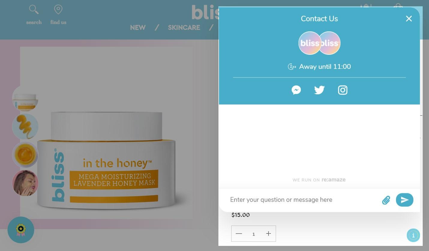
If we go back to Bliss, we see a popup chat option at the bottom right corner of every page.
It shows if any customer service reps are available to chat right now, and gives the opportunity to message the company directly, or via Facebook Messenger, Twitter, or Instagram.
3. Use color psychology to engage your target audience
Color psychology is the theory that varying colors can conjure up specific feelings or moods. We recommend using color psychology not only on your product pages, but also in your overall company branding.
Here are some key colors, and what color psychology says about the tone they can convey.
| Color | What it Conveys |
| Red | Excitement, energy, passion, danger |
| Pink | Femininity, playfulness, unconditional love |
| Orange | Creativity, enthusiasm, adventure, balance |
| Yellow | Happiness, positivity, optimism, warmth |
| Green | Health, growth, fertility, generosity |
| Blue | Peace, calm, stability, trust |
| Purple | Power, luxury, wisdom, nobility |
| White | Innocence, cleanliness, humility, goodness |
| Black | Power, elegance, sophistication, mystery |
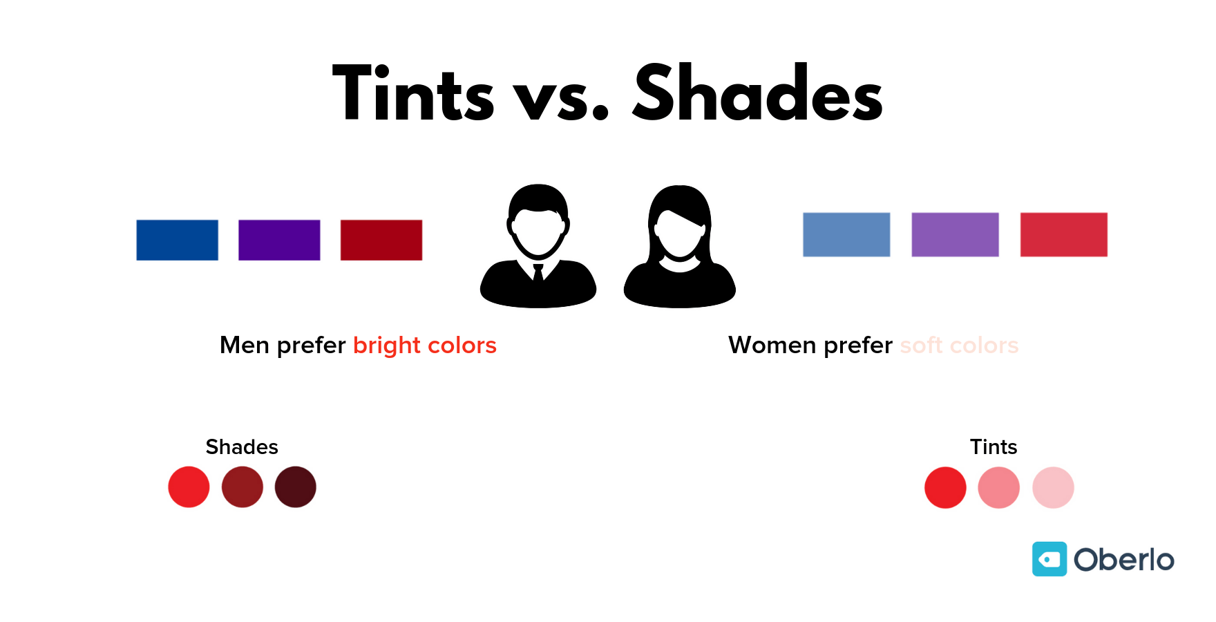
It’s also important to consider the personal preferences of your audience. For example, one study on gender and color showed that men prefer shaded colors (colors with black added), while women prefer tinted colors (colors with white added).
The researchers found that color schemes with tints are soft, soothing, and youthful, while a scheme with shades is powerful, mysterious, and deep.
Of course, none of these assumptions will be right 100% of the time – there will always be exceptions and outliers based on your company and your audience.
BONUS Color Psychology Quiz
You now know what a product page is, which elements make a page truly effective, and which Shopify product page apps could help you with your own store.
Next, let’s get more granular and examine how to write awesome product descriptions for your product pages.

