In the previous chapters, we talked about how to craft your buyer’s journey, how to build a sales and marketing funnel around it, and ‘funnel hacking’ your way to a profitable funnel that can bring in profits for your online business consistently. In this chapter, we’ll talk about another important piece of the puzzle: conversion rate optimization, also known as CRO.
Firstly, what is conversion? The term essentially refers to a visitor on your site taking the action that you want them to take – like signing up for your email list or buying your product.
For example, if you’re selling services, you might be trying to get more people to sign up for a consultation call. If you’re selling e-commerce products, you might be trying to get more visitors to add products to their cart, or checkout once they’ve added those products. If you’re selling software, you might want to get visitors to book a demo with a sales rep.
Whatever you’re trying to get your visitors to do, you’ll want to systematically decide how to get them to take that action – whether it’s through your website design, your copy, or a combination.
The reality is, paid advertising is only getting more expensive, and if there are issues in your funnel, then you’re leaving money on the table. Conversion rate optimization helps you identify those problems in your funnel first, so you can bring in more revenue for every dollar spent on advertising.
Conversion rate optimization also helps you maximize profits, as your profits are innately tied to your conversion rate.
In this chapter, we’ll talk about conversion rate optimization tips, examples, and strategies. We’ll also give you an example of a conversion rate optimization audit checklist.
Depending on how deep you go, conversion rate optimization can be an advanced subject given how much it involves data and statistics.

Don’t wait for someone else to do it. Hire yourself and start calling the shots.
Get Started Free5.1 Essential Conversion Rate Optimization Terms You Need to Know
Before we discuss conversion rate optimization in detail, let’s go over some essential definitions for this section.
A/B testing (or split testing)
A/B testing refers to testing one version of a page against another version the same page with one slight change. The effectiveness of the pages is then measured against each other.
For example, if the objective is to increase clicks to the pricing page from the home page, you might test two different home page layouts that look identical apart from the ‘pricing page’ link copy.
When you do A/B testing, you only test one element at a time.
Multivariate testing (MVT)
Multivariate testing is a more advanced form of testing that refers to creating multiple variations if different page elements in different combinations to gauge which combination performs the best.
In a multivariate test, you might test different variations of pictures, copy, colors, and/or layouts to see which combination is most effective at driving the action that you’re looking to drive.
Bounce rate
Your bounce rate refers to the percentage of people who leave your website after viewing a single page. If you have a high bounce rate, it means that your visitors aren’t finding what they’re looking for.
Average time on site
The time on site metric shows you exactly how long visitors are staying on your page before leaving. If you have a low time on site, you probably also have a high bounce rate – this means that visitors aren’t finding what they’re looking for on your site.
Primary conversion
The primary conversion goal refers to the most ideal action that a visitor can take on your site.
For example, for an e-commerce site, your primary conversion objective would be the ‘Add to Cart’ button.
For a subscription site, it would be the ‘Sign up now’ button.
Secondary conversion
The secondary conversion goal refers to the next best action a visitor can take if they’re not yet ready to click on the primary call to action.
For example, for an e-commerce site, it might be viewing product details. For a software company, it might be clicking through to the pricing page. For a subscription site, it might be requesting more information.
Customer acquisition cost (CAC)
Your customer acquisition cost is the cost you pay to acquire a new customer. One of the benefits of conversion rate optimization is that can immediately cut your CAC by a significant margin. For example, if your conversion rate doubles, your CAC will get cut in half. You can take that money and spend on additional acquisition, if you see fit.
5.2 How to Conduct a Conversion Rate Optimization Audit
The core of conversion rate optimization is about finding out why visitors don’t become customers, and fixing those problems. That’s why before you can tweak your website or your funnel to improve conversions, you need to conduct a full audit of your site and current traffic sources.
Here’s a full conversion rate optimization audit checklist:
Step 1: Evaluate your business goals
Before you start your audit, it’s important to have a real idea of what you want to get it out of it.
For example, let’s say you have an e-commerce store that sells nutrition supplements, like Organifi. For most e-commerce stores, sending promotional emails to an email list is a great way of generating sales. Let’s say that’s a key component of driving revenues for your business.
In a situation like that, your secondary conversion goal might be to get users to subscribe to your email list in exchange for some kind of opt-in incentive.
Based on that information, you can then get a better understanding of where to start when it comes to evaluating your site – for example, if you want to get more email subscribers, you might analyze your current pop-up boxes, opt-in forms, and other opt-in incentives to find out exactly how you can get the most signups.
If you don’t have Google Analytics installed on your site already, this would also be a good time to do that. We’ll talk more in-depth about measuring analytics in the next chapter, but Google Analytics can provide a good foundation for analyzing your site. For example, you can get a sense for certain pages or screens that users visit, how many pages are in one session, how long they spend on the site, and more.
You can also tie each ‘action’ on the site to a dollar value. For example, let’s say you know that out of every 1000 visits, you get 10 opt-ins, and out of 10 opt-ins you get 3 customers. If each customer has a lifetime value of $70, then you can say that each ‘view’ is worth $0.21 to your business.
Step 2: Evaluate your UX
UX stands for user experience.
The user experience of your site involves the entire experience that a customer has when they visit your site, from beginning to end.
UX is about more than just visual design or how a website looks. It’s about how intuitive it feels, how easy it is to navigate, how fast the pages load, and more. A site might look amazing, but if the pages take a long time to load, then that’s bad UX.
There ‘user experience honeycomb‘ can be used to describe some of the most important aspects of UX design.
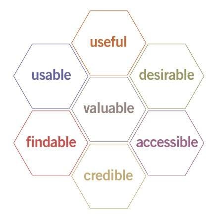
Usefulness: How useful is your site? Does it help your visitors achieve their goals, or is there a high bounce rate because visitors aren’t finding what they’re looking for?
Usable: How is your navigation? Does it feel natural? Does the process of completing your primary conversion goal feel intuitive? If not, you’re going to have issues with your conversion rate.
Desirable: Sure, visual design is only a small part of UX design as a whole, but you need to make sure that your site feels desirable to use. Don’t send users to a dull website that feels outdated.
Findable: Can users find what they need to find on your site? Do they have to think about what to do, or are they able to naturally do it?
Accessible: Just as buildings have elevators and ramps, your website should be accessible to people with disabilities.
Credible: Does your website appear credible? Part of this involves visual design, but it also involves things like security, reviews, testimonials, and more.
Step 3: Evaluate your analytics
If your website analytics aren’t accurate, then your conversion rate optimization audit won’t be accurate either.
It’s very important to to make sure that your analytics are set up properly without errors.
If you spend time double checking your analytics set up, you’ll save a lot of time down the road. You won’t have to worry about making mistakes and making decisions based on corrupted data.
Here are a few key things to keep in mind as you’re setting up Google Analytics on your site:
- Are you collecting enough data?
- Are you collecting credible data?
- Are there are technical errors that you need to fix?
When it comes to technical errors, here are some common mistakes people make:
Filter settings:
In many cases, you might just be looking at the wrong data in Google analytics because of applying incorrect filter settings.
This can happen if you include multiple ‘include’ filters.
Multiple tracking codes:
If you have multiple tracking codes of Google Analytics on your web pages, it might throw off your data (especially if you’re using Classic Analytics).
Wrong tracking snippets:
Another big mistake that people make is using the wrong tracking codes on a website to track data. This can be the case especially if you’re managing multiple websites.
Incorrect account view:
If you have access to the analytics of multiple websites, you might be using the incorrect account view, or an incorrect tracking snippet from a different account than the one you’re looking to assess.
Another set of common issues have to do with the tag manager:
Unpublished container
Double check to make sure the container is published after you add the Analytics tag. You can make changes to a container, but it won’t actually take effect until it’s published. We’ll talk more about this in the next chapter.
Wrong trigger configuration
Sometimes a trigger that you set up won’t fire as expected. It’s important to double check the conditions you’re targeting and the trigger behaviors that you have set.
By making sure that your analytics set up is done properly, you can save a lot of time by collecting accurate data from the very beginning.
Step 4: Collect qualitative data
Conversion rate optimization isn’t just about statistics and analytics.
Collecting qualitative data can be just as useful, if not more useful, when adjusting the UX of a website.
One way to do this is by conducting usability tests.
Usability tests are an effective way to see, in real time, what challenges or issues users have when completing primary or secondary goals on your website.
For example, you could get a group of ‘test users’, give them a set of tasks, and watch how they complete them on your site. If the demographics of your test users are similar to the demographics of your actual visitors, you’ll get a pretty good gauge of how your actual visitors are interacting with your site. You can watch them as they figure out how to complete the goals you set for them, and get feedback from them afterwards.
Even if you think your site is very user friendly, you’ll likely find areas that are hard to navigate
Chances are you’ll find that certain areas of your site are hard to navigate or have unnecessary friction.
A quick way to conduct usability tests at once is by using a site like UserTesting.
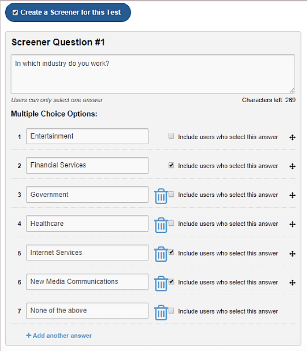
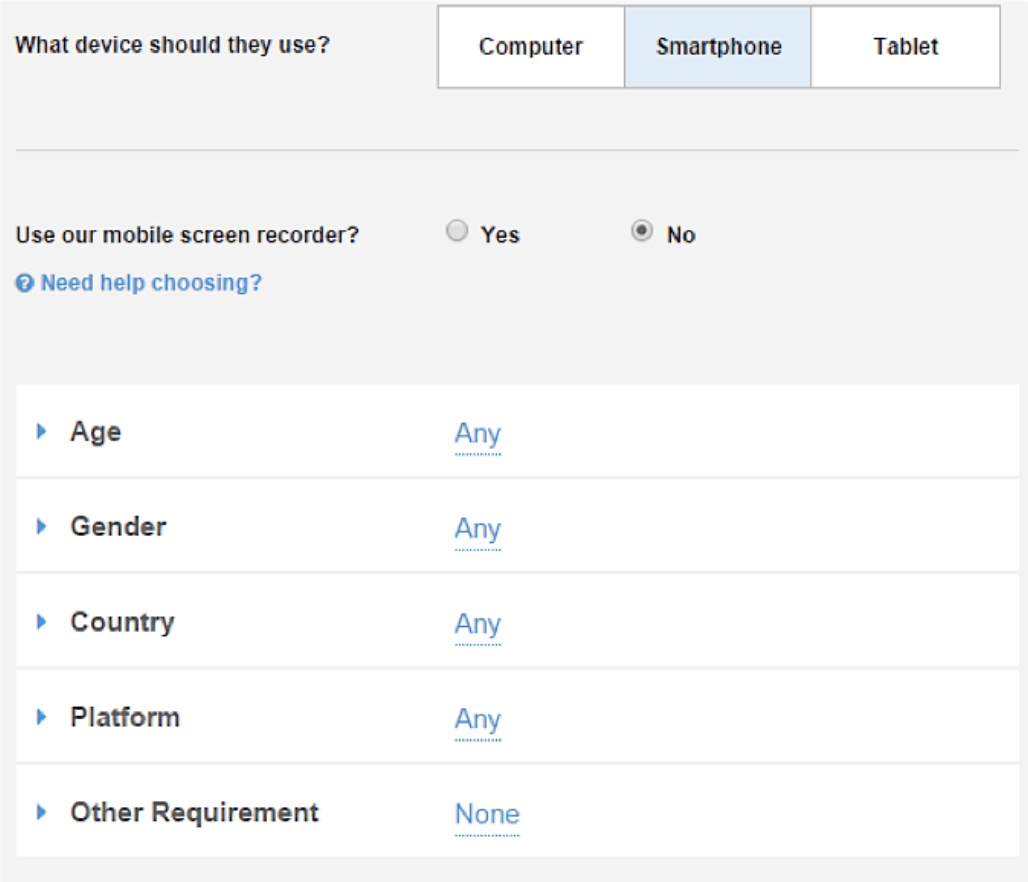
UserTesting has a wide range of testers from different demographics. To make sure that you’re getting the right people looking at your site, you can create filters and screener questions. For example, you can have people answer what industry they work in before they go through your website.
You can also set your demographic filters by criteria like age, gender, country, and even what device they should use.
5.3 Conversion Rate Optimization Examples (And Case Studies)
In this section, we’ll break down some examples of companies that have conducted tests to boost the conversion rate on their site.
We’ll show the test they ran, the results, and more.
How Kuna boosted sales by 89%
Kuna is a business that sells home security products.
Initially they had approached an marketing agency with plans for a full website redesign. They thought that revamping the website was what they needed to do in order to grow sales.
Before executing on a strategy,the agency decided to run a series of mall experiments to decide how they should approach the redesign. They wanted to see whether or not a complete overhaul was needed, or whether small tweaks could do the trick.
The ultimate goal was to focus the conversion improvement efforts on home page bounce rates, purchase conversions, and total sales.
Here’s how they did it:
First, they started by collecting qualitative data. In this particular case, they conducted a simple survey. They spent time understanding what motivated their customers to purchase, They spent time understanding the way customers perceived their products and talked about them.
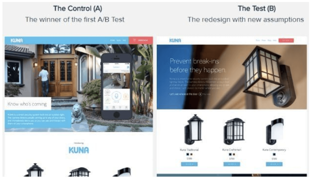
Based on that qualitative data, they performed some updates according to the data. They changed the cover photo, the copy, and the overall feel of the home page of the site. They updated the home page with a red ‘buy now’ button as well, and moved a demo video above the fold.
The copy was changed to reflect how customers actually spoke about the product and their motivations around buying (i.e. “prevent break-ins before they happen” as opposed to “know who’s coming”).
These changes grew sales by 89% in just three weeks.
This proved that the change in content above the fold helped communicate the product’s value in a more effective way.

Kuna performed more tests in which they focused more on addressing the needs of their customers, revamping the checkout process, and in general, improving the site’s credibility.
Over the next several months, they ended up growing revenues by 265%.
The biggest takeaways from this conversion rate optimization example is to make sure that the language you’re using reflects the language that your customers use. We touched on this in the funnel hacking chapter, and it’s an important component to growing conversions.
It’s also important to create a certain level of visual intrigue on the homepage as well, to help communicate your product’s story faster and more effectively. And of course, improving navigation to make the shopping and checkout experience as seamless as possible will also help improve your conversions.
How Morphsuits boosted their conversion rate by 37%
Morphsuits is an online retailer that sells full-body spandex costumes.
Based on their analysis in Google Analytics, they found a checkout page that was underperforming in terms of conversions. They ran some deeper tests to get a more accurate gauge of what exactly about the page was causing it to underperform.
They went through a deep optimization process, ran some A/B tests and usability tests, and figured out exactly what their problem was.
After they got a sense for what was at the root of the problem on the checkout page, they started testing out potential improvements.
What they discovered was something expected.
They found that a major issue in the checkout flow was at the ‘order review’ stage. This is the stage after visitors had added items to the cart, but haven’t purchased. At this stage, customers are seeing that everything in the cart matches up with what they put into it.
Initially, they had a very basic order review page – a black and white page with no pictures and poor visual design. While it displayed all the necessary information, it just wasn’t appealing to look at.
Check out version B below, this is the new order review page that Morphsuits came up with:
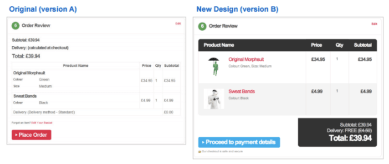
With the new design, they were able to boost conversions by 37%, just with simple improvements in visual design.
You can take away a couple of things from this experiment:
- By breaking down your analytics, you can find specific pages that have issues when it comes to users checking out (or completing the primary goal on your site).
- It’s incredible how relatively simple style changes or color changes can have a massive impact on your bottom line.
Chapter 5 takeaways
- Essential terms to understand when talking about conversion rate optimization is A/B testing, Multivariate testing, bounce rate, average time on site, primary conversion, secondary conversion, customer acquisition cost, and so on.
- When it comes to conversion rate optimization, be sure to understand the language your market is using to solve their problems.
- Take a look at the above conversion rate optimization examples for strategies and tips.
The main steps to conducting a conversion rate optimization audit are evaluating your business goals, evaluating your UX, evaluating your analytics, and collecting qualitative data.


