The Ultimate Store Review to Increase Sales
You slug away at your dropshipping store. You get tons of traffic. But somehow, they’re not converting. In this video, we compare two dropshipping stores and analyze what they’ve done right and their mistakes to help you understand what you should look out for to optimize your store to increase sales.
Video transcript: You’ve found a product to sell, you set up your dropshipping store, you’re running ads and still no sales. So now what? I’m going to share my strategies for reviewing a dropshipping store to find out what needs to be fixed to increase sales.
When you’re a beginner dropshipper, it can be frustrating to do all that work without any sales. But failure is not the opposite of success, it’s a part of it. After helping hundreds of dropshippers, I’ve noticed the same mistakes over and over again. So today, I’ll tell you what to look for to optimize your store to increase sales.
By the end of this video, you’ll know a simple store template to increase sales, what apps you need to boost conversions and how to use store analytics to optimize your store for sales. Ready to get started?

Don’t wait for someone else to do it. Hire yourself and start calling the shots.
Get Started FreeStrategies High-Profit Stores Use to Increase Sales
Hey everyone. It’s Jessica from Oberlo. Today, I’m gonna show you how I review dropshipping stores that aren’t seeing any sales. Dropshipping, by the way, is one of the easiest ways to start an online business. Instead of flying tons of inventory for your online store, you only order products when you get sales. Your supplier ships your orders for you so you can sell it to customers all over the world. But being a successful dropshipper requires constant learning.
To be a successful dropshipper, you need to embrace challenges. Succeeding any commerce is all about figuring out what’s not working and how to change it.
If you’re not seeing any sales, you might start wondering if dropshipping even works. You’ve read the success stories and yet you can’t seem to understand what’s so different about your store.
After reviewing hundreds of dropshipping stores, I can tell you exactly what sets high-profit stores apart from failing stores. Today, I’ll tell you how to implement the same strategies that high-profit stores use to your store to increase sales.
Now, I’m going to assume that you’re already driving traffic to your store. If you aren’t, check out our free Facebook Ads course. It will show you step by step how to find an audience and start driving traffic to your store.
All right, let’s dive into store review strategies. We’ll start on the store homepage. Throughout this video, we’ll look at a beginner dropshipping store that sells women’s leggings and a professional ecommerce store that sells popcorn.
1. Optimize the Banner Image
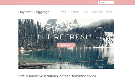
Let’s begin reviewing your store by starting with the banner image. Now throughout the store review, it’s important to put yourself in your customer’s shoes. Customers have low attention spans. It’s up to you to grab their attention and make it easy for them to shop.
Usually, one of the first things customers notice is the banner image, right here. Your banner image should be a high-quality photo of a product or a photo that’s relevant to your dropshipping niche. If you use low-quality images, you could turn off customers.
But don’t worry, you don’t need to be a photographer to get high-quality photos for your banner. These images are from Unsplash, a free stock photo website. You can also check out Burst by Shopify for niche-specific stock photos such as this collection for yoga or this collection for fashion.
As I said, however, your photos don’t need to be of the product you’re selling. You can also use photos that just relate to your branding. For example, a photo of someone lounging in a pool or a photo of a beach would work great if you’re selling sunglasses.
2. Organize Store’s Menu
As you continue reviewing your store, consider your store’s menus. Store menus appear near the top or sometimes on the side of your store homepage. Menus link to other pages of your online store. Menus should make it easier for customers to find out about your product, learn about your brand, get in touch with you, and ultimately, increase sales.
There are four standard menu options that I recommend for online stores. These are returns, shipping, about and contact information.
Each of these menu options can link to a separate page in your Shopify store. You can also combine returns and refunds and shipping information or include them in an FAQ.
Now you might be wondering if all these pages are necessary. But again, think about your customer’s experience. If your customer is shopping for a gift for a friend’s birthday, they’ll want to know about shipping times. After all, they wouldn’t want to receive a product after their friend’s birthday has come and gone. But if that customer can’t find any information about shipping times and if they can’t find any way to contact you and ask about shipping times, you’ll lose that sale.
As you see on Pipcorn, the ecommerce popcorn company, there are “About Us”, “Contact Us” and “FAQ” pages with all relevant information.
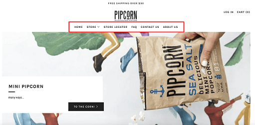
And if you click on the “FAQ”, you even see shipping information for shipping outside of the US.
The leggings dropshipping store nests in “About Us”, “FAQ” and contact page under the “About” menu option. This makes it just a little hard to find. If I were reviewing this store, I would suggest that the store owner make these pages a bit more obvious by putting them right here within the top items of the menu itself.
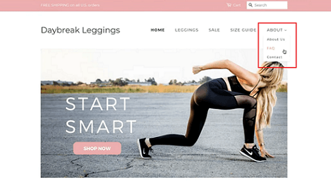
One thing I do like here is the size guide. If you’re selling a product that comes in different sizes or is difficult to use or is only compatible with certain devices, make a separate page with that information. Then include the page in your header menu so that customers can find it easily.
You may have noticed that both the legging store and Pipcorn have a banner advertising free shipping. Well, it may seem like a small detail, but advertising free shipping can help you increase sales.
Studies show that only 35 percent of shoppers are willing to pay for shipping. If the other 65 percent are browsing your store and don’t see free shipping, they may leave.
As you’re setting up your store menu, don’t spend hours working on your “About Us” page. Check out our video afterward that outlines exactly how to create an effective “About Us” page instead. Uploading high-quality images and creating helpful store menus are the first steps to creating a trustworthy store that gets sales.
3. Highlight Products on the Homepage
My next strategy might seem a bit obvious, but I’ve seen too many dropshippers skip it. You must highlight one or a few products on your store’s homepage. Even if you’re selling hundreds of products, it’s important to draw your customer’s attention to your most eye-catching ones. If your customer has to click through a collection to see a product, you might lose them.
I suggest highlighting a product at the top of the home page or just below the banner image. This way, your customer sees it right away. I love the way Pipcorn does this. Right after the banner image, Pipcorn highlights its best-selling products. Pipcorn offers more than free products, but this formatting drives customers to high-converting product pages right away. When selecting products to highlight on your homepage, choose products that have eye-catching photos and well-written product descriptions.
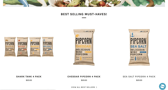
Remember, this may be the last thing your customer sees before they click “buy” or they click “back”. Check out our video on writing high-converting product descriptions.
4. Create a Sense of Urgency
Once you have your homepage squared away, you can start to look at other tools to help you boost conversions. And by tools, I mean apps. The Shopify App Store has a wide variety of apps that you can use to help you increase sales. Although there are many to choose from, I suggest two to start.
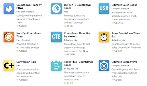
The first is an app that creates urgency. As a dropshipper, your ideal customers are impulse buyers. Impulse buyers make purchases because they see something they want and they feel like they need it now. Urgency apps help to reinforce that feeling. If your customer doesn’t feel a sense of urgency, they may decide to save their money or go comparison shopping.
The Shopify App Store has a wide selection of countdown timers that you can load onto your product pages. To find these apps, simply go to the Shopify App Store and in the search bar, type countdown timers. When customers see that they only have so much time to take advantage of a sale, they’ll be more inclined to buy.
5. Collect Emails
While impulse buyers are great, you’ll get lots of store visitors who are interested in your product but don’t buy right away. However, just because they don’t buy right away, it doesn’t mean they never will. That’s why I suggest you install an app that collects emails.
There are many email marketing apps in the Shopify App Store. You can use almost all of these apps to email potential customers about sales and special offers.
The average customer needs to see a product three to seven times before they make a purchase. So keep those emails coming.
It’s a good idea to offer an incentive to store visitors to give you their email. Pipcorn does this well. They offer a 15 percent discount code in exchange for an email address. The legging store does this too. Store visitors have a chance to win a free pair of leggings if they enter their email. Every month, this dropshipping merchant picks one new email sign up and gives them an individual coupon good for one pair of leggings.
There are many apps that can help increase store conversions. However, these are the two that are most popular with dropshippers.
6. Understand Your Analytics
It’s time for the last strategy for optimizing your store to increase sales. You’ve got to understand your analytics. Whether you’re running online ads, focusing on SEO, or simply trying to drive traffic for your store’s social media, it’s important to track store visitor behavior.
Remember, I’m assuming that you’re already driving some traffic to your store. If you’re not, I suggest watching either our Facebook Ads Course or our free traffic video.
Every Shopify plan comes with an analytic section that you can access from your admin. Here, you can find information to help you understand why you’re not getting sales. Your analytics dashboard has a wealth of information. Well, it’s all helpful. I’ll highlight a few of the most important sections to look at.
Online Store Sessions by Location
The first dashboard section to look at is “online store sessions by location”. This shows you a breakdown of what countries your store visitors are coming from.
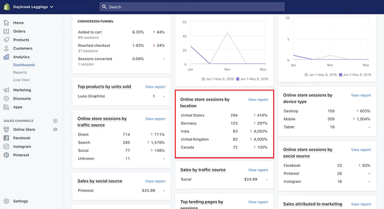
You can use this information to advertise to the countries that are already sending you the most website traffic. For example, this store gets the most traffic from the US and Germany. So this merchant would do well to advertise to customers in the US and Germany.
You can also use this information to decide whether you want to translate your store or use a currency converter. For example, this legging store gets enough visitors from the EU and the UK that a currency converter app might be helpful. That would allow visitors to see store prices in Euros and Pounds respectively.
Remember, your customers will be charged in your main currency at checkout. So this would be another great piece of information to include in your store’s FAQ.
If you’re looking for a currency converter app, just visit the Shopify App Store and search for “currency converter”.
Online Store Sessions by Device Type
The second dashboard section I suggest reviewing is “online store sessions by device type”. If you’re seeing a lot of traffic coming from mobile, then it’s important to test our storefront and product pages on your mobile device.
You can do that on your own phone. Just pull up your store on your mobile device and try going through checkout. Ask yourself, is the text legible or the button is easy to use? Is it easy to navigate the menus?
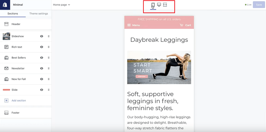
You can also see what your store looks like on mobile within Shopify. Just go to “online store” and click “customize”. At the very top, click the mobile icon. Now you can adjust your store design so that it looks great on smaller screens.
Top Landing Pages by Session
Let’s go back to the dashboard. The last section I suggest looking at is “top landing pages by session”. This will show you a breakdown of exactly how many people visit your store, look at the products and even reach checkout. You can use this information to optimize your ecommerce store.
If your traffic is only visiting your storefront and not clicking on products, then you might need to work on your homepage. Are the images crisp and compelling? Do you highlight at least one product? Is it easy for visitors to browse your main menu?
If your traffic is visiting your product pages but not checking out, then you might need to work on your product pages. Use high-resolution images and write your own product descriptions. Let me repeat that.
Write your own product descriptions. Don’t rely on AliExpress for that one.
Now, I’d love to hear from you. When reviewing a store, is there anything that you look that can help to increase sales for that I didn’t talk about? Let me know in the comments and I’ll chime in with my thoughts. Thanks and until next time, learn often, market better and sell more.
